Discover perfect blue color palettes for your next project! Explore our guide with easy-to-use hex codes, design tips, and how to evoke the right emotions.
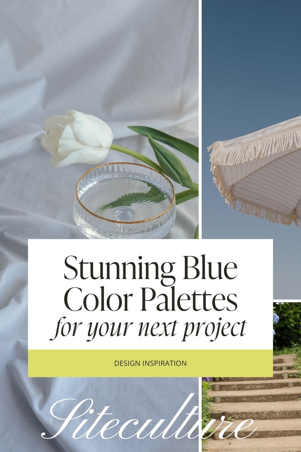
When it comes to creating stunning designs—whether you’re working on branding, web design, or even interior projects—choosing the right color palette is key. And if there’s one color that never goes out of style, it’s blue. From soft, serene shades to deep, moody hues, blue has this incredible versatility that can evoke a range of emotions.
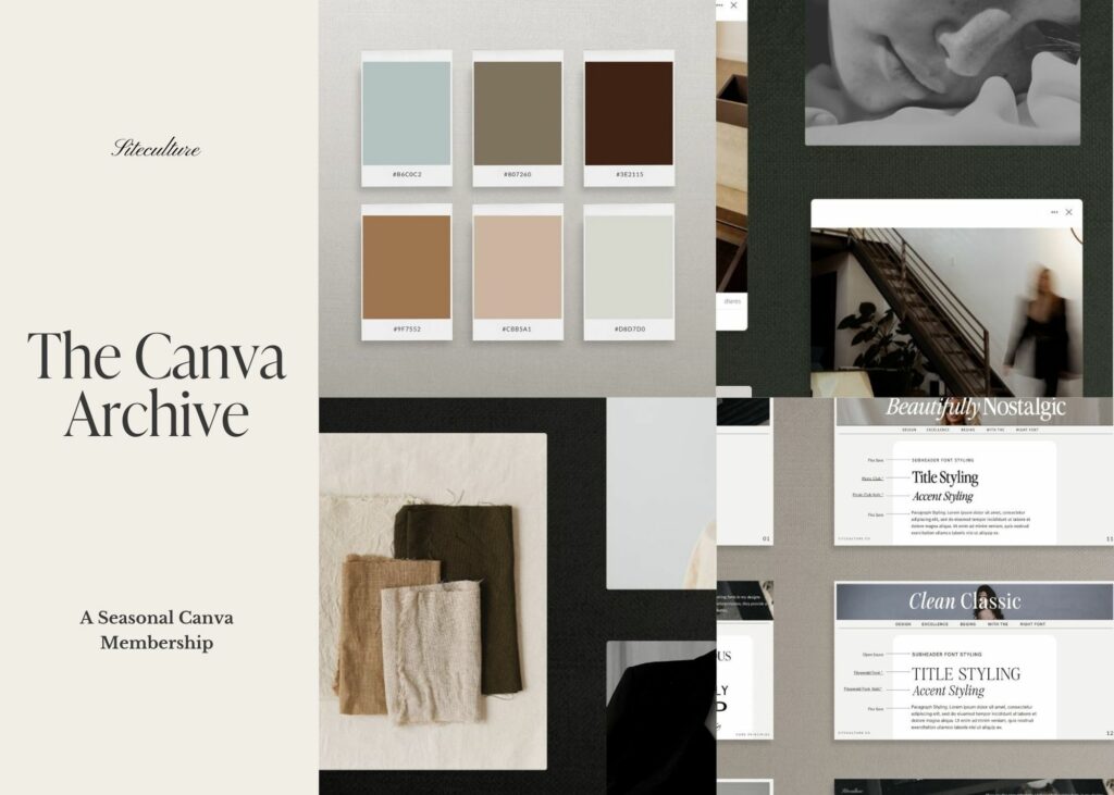
In this post, we’re diving into a few beautiful blue color palettes and their corresponding hex codes to help you easily incorporate them into your next project. Plus, we’ll talk about how each palette can set the tone and mood for your brand or design work. Spoiler alert: There’s a blue for every vibe (we are looking at you, Serena and Lily)! Oh, and don’t forget to check out The Canva Archive—the ultimate tool for getting creative with your color choices, fonts, and stock photos (all for just $10!).
Let’s get started!
Stunning Blue Color Palettes For Your Next Design Project
1. The Calm & Earthy Blue-Green Color Palette
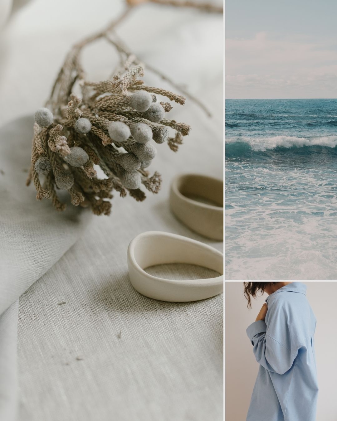
If you’re looking for a palette that feels grounded but also fresh, the blue-green combo is a winner. It’s got a hint of nature—like the sea meeting the forest—which brings a sense of tranquility and balance to any design. This palette is perfect if your brand has a calming, natural, or wellness vibe.
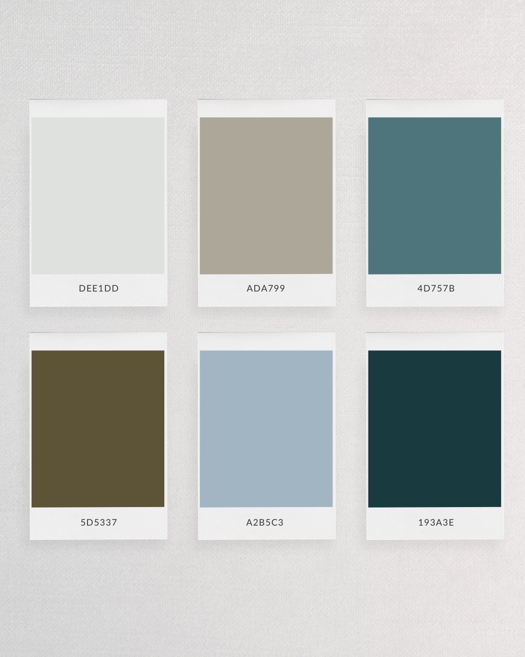
Hex Codes:
- DEE1DD (Light Mist Blue)
- ADA799 (Warm Grey)
- 4D757B (Teal Blue)
- 5D5337 (Olive Green)
- A2B5C3 (Soft Sky Blue)
- 193A3E (Deep Forest Green)
Emotions Evoked: Calm, harmony, and a connection to nature.
Think about a wellness brand, eco-friendly products, or even a lifestyle blog focused on mindful living—this palette will give your audience that sense of peace and connection to the natural world. It’s refreshing and reassuring, which makes it a great choice for anyone looking to build trust and serenity in their brand.
2. The Modern & Sleek Blue-Grey Color Palette
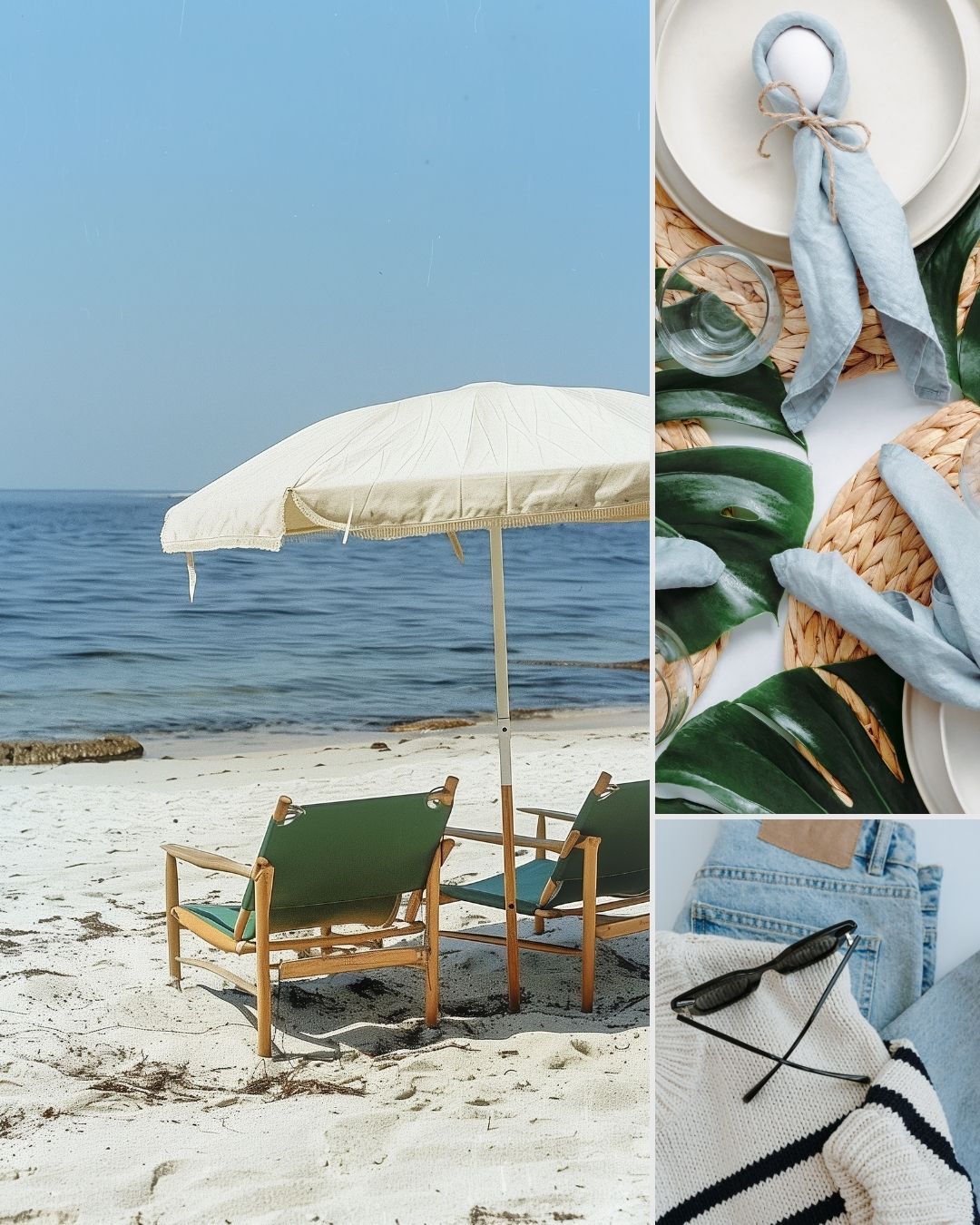
Looking for something that’s cool and sophisticated but still approachable? The blue-grey palette is your go-to. It’s a little more on the muted side, which makes it perfect for projects that need to communicate professionalism and clarity. This color combo is often used in tech, finance, or any industry that wants to say, “We’ve got this!”
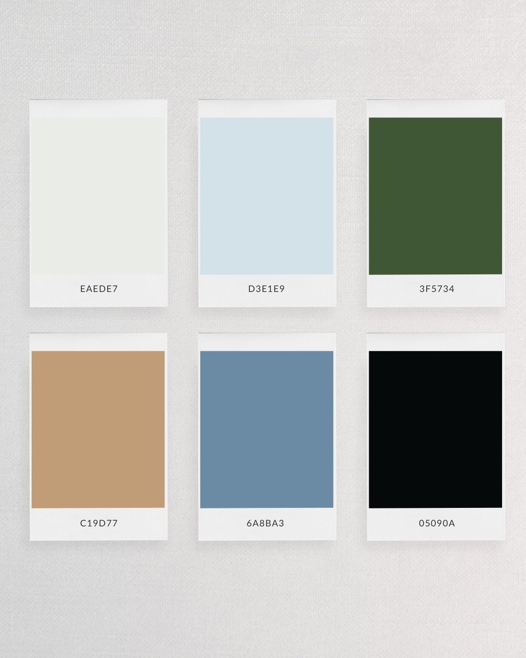
Hex Codes:
- EAEDD7 (Creamy Off-White)
- D3E1E9 (Soft Blue)
- 3F5734 (Deep Green)
- C19D77 (Warm Beige)
- 6A8BA3 (Steel Blue)
- 05090A (Almost Black)
Emotions Evoked: Sophistication, calm, and modern professionalism.
If you’re working with a brand that values precision and trust (think financial services, tech startups, or consulting agencies), this palette will give off that polished, high-end vibe. It’s understated, but in a powerful way—perfect for making a subtle yet impactful impression.
3. The Fresh & Airy Light Blue Color Palette
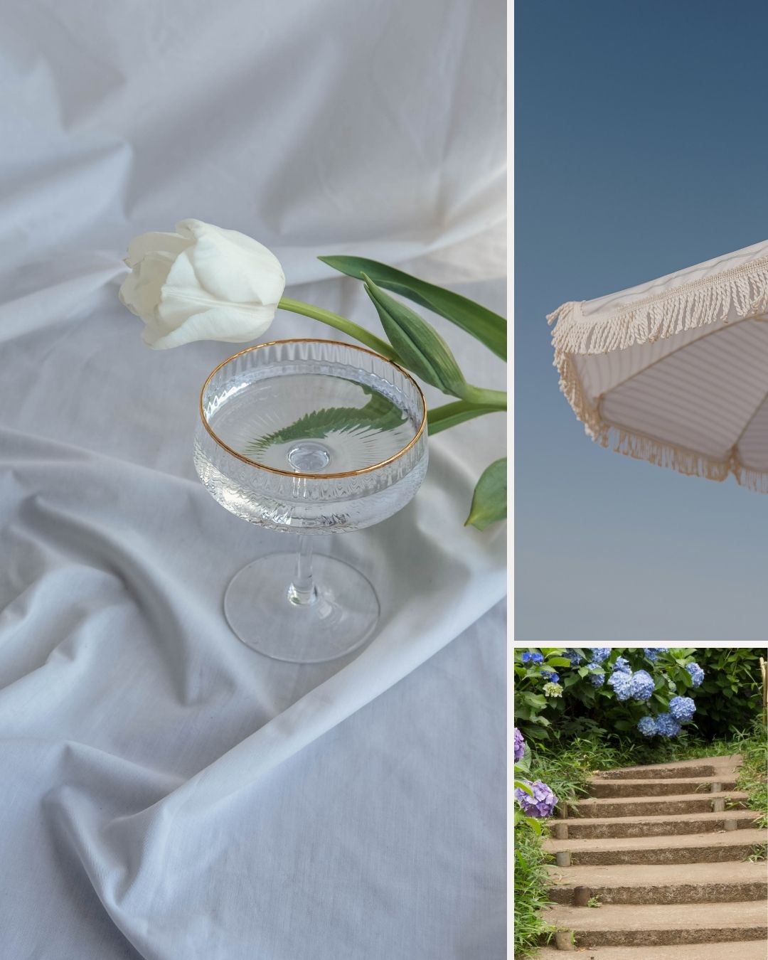
For those of you wanting something a bit more lighthearted, a light blue color palette can feel like a breath of fresh air. These soft, dreamy hues create a sense of openness and peace, making them ideal for projects that need to feel approachable and welcoming. Whether it’s a beachy brand, a wellness blog, or even a home decor website, this palette brings the calm.
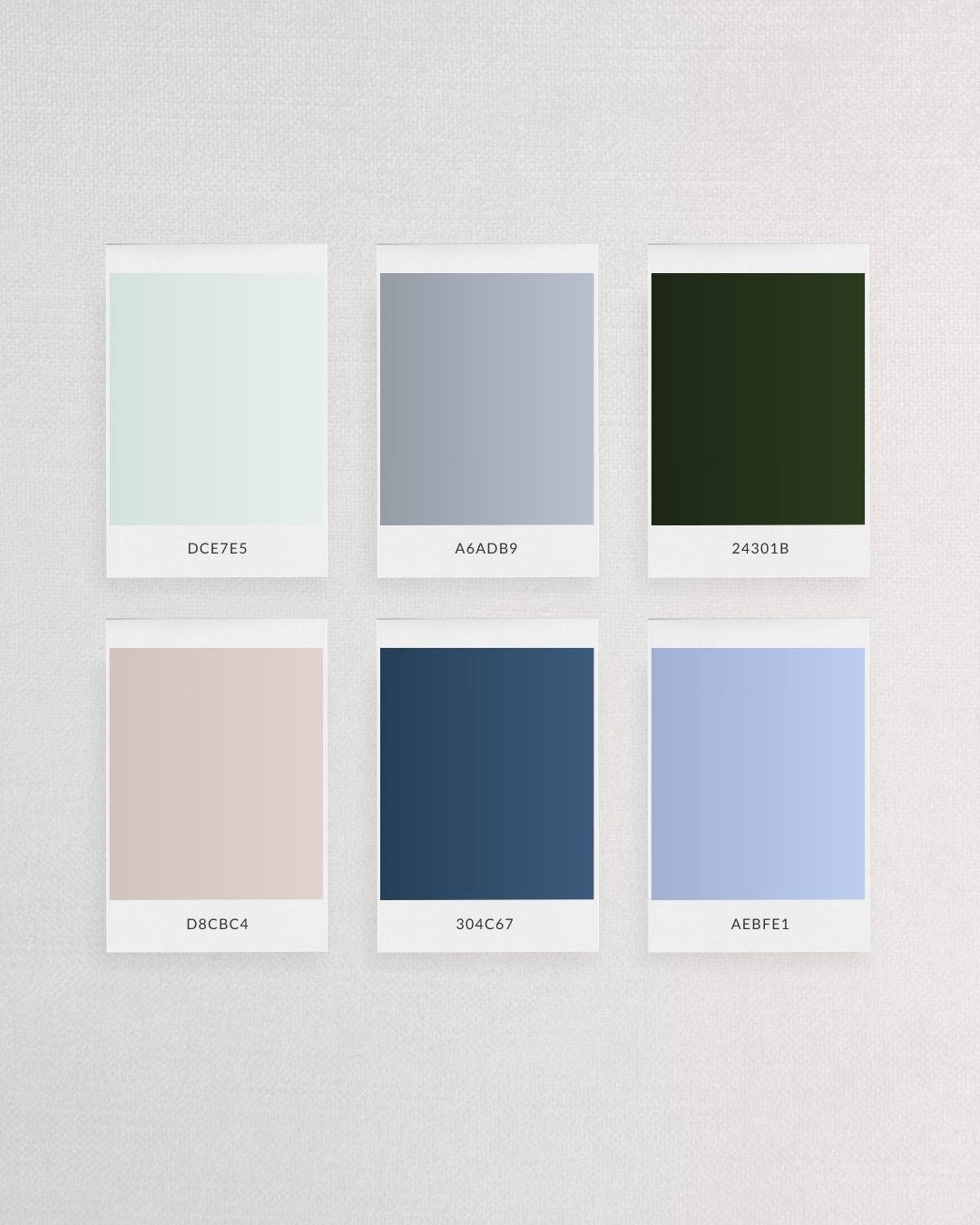
Hex Codes:
- DCE7E5 (Pale Aqua)
- A6ADB9 (Dusty Blue)
- 24301B (Forest Green)
- D8CBC4 (Light Sand)
- 304C67 (Deep Ocean Blue)
- AEBFE1 (Powder Blue)
Emotions Evoked: Fresh, serene, optimistic, light.
If you’re working on a travel blog, coastal lifestyle brand, or even a wellness retreat site, these soft blues paired with natural greens and sandy tones can help create that peaceful, inviting atmosphere that everyone will want to escape to.
4. The Timeless Neutral Blue Color Palette
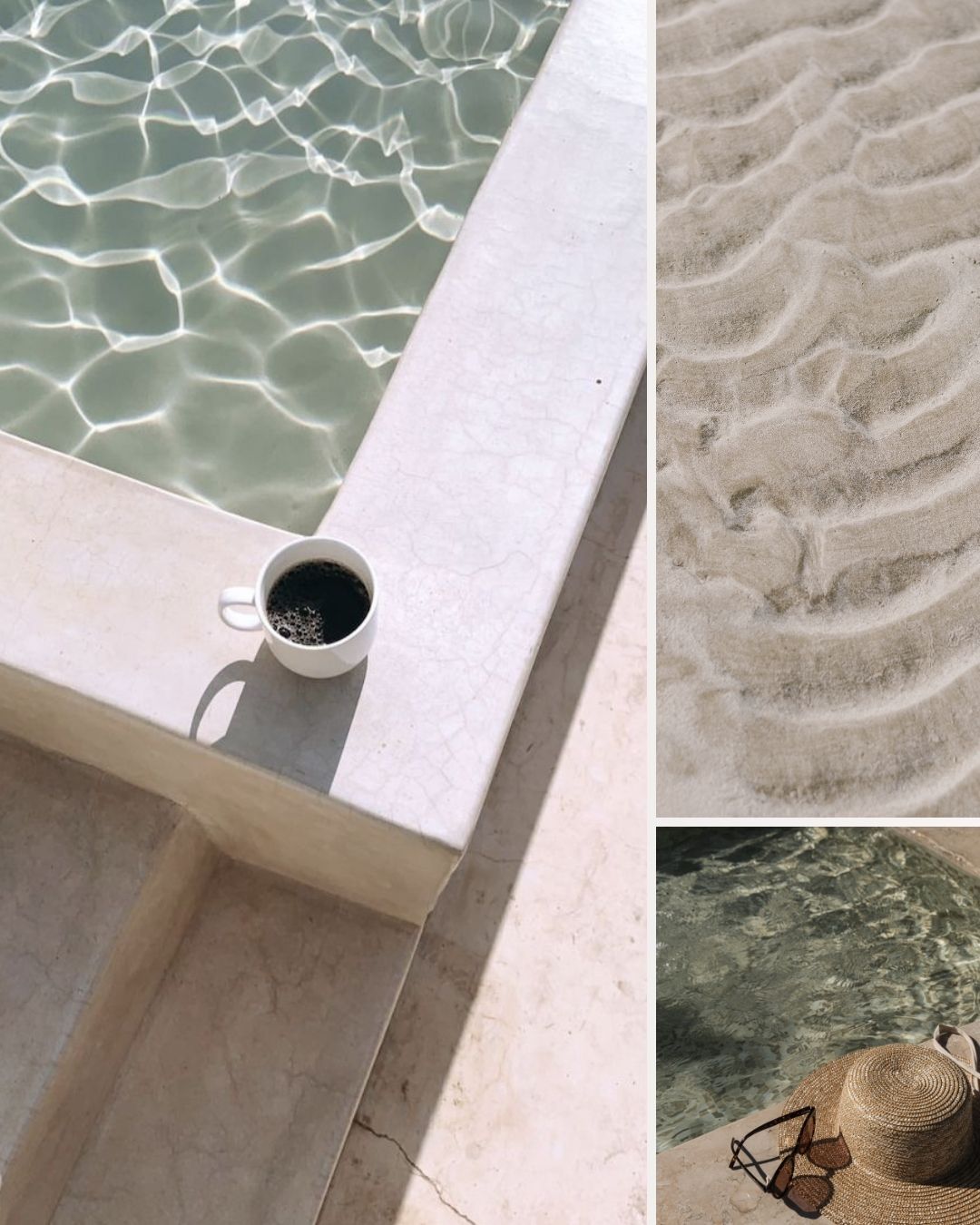
Sometimes, you want a palette that feels modern but also timeless, and that’s where neutral blues come in. These palettes combine soft blues with earthy, neutral tones to create a balanced, sophisticated look. It’s perfect for brands that want to stay trendy but also rooted in classic design principles. Think interior design, lifestyle products, or high-end home decor brands.
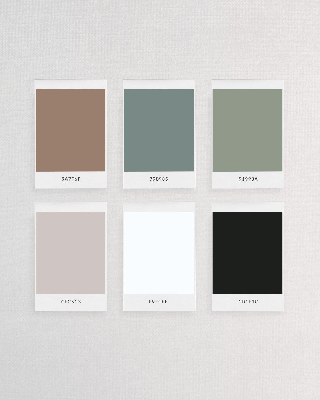
Hex Codes:
- 9A7F6F (Warm Beige)
- 798985 (Muted Teal)
- 91998A (Sage Green)
- CFC5C3 (Warm Grey)
- F9FCFE (Crisp White)
- 1D1F1C (Black)
Emotions Evoked: Timeless, sophisticated, grounded.
This palette is perfect for creating a serene and elegant environment—whether that’s in a physical space like home decor or in digital branding. Its earthy yet cool tones make it adaptable for a variety of projects, offering a sense of calm sophistication that feels both modern and timeless.
Why You Need The Canva Archive in Your Toolkit
Creating cohesive designs—whether for branding, web design, or even interiors—gets so much easier when you have a solid resource to rely on. That’s exactly what The Canva Archive offers. For just $10 (lifetime membership!), you get access to:
- 20 Designer-Curated Canva Font Pairings
- A Stock Photo Library (like the gorgeous images featured here)
- 10 New Designer-Curated Color Palettes Each Season
The Canva Archive saves you hours of searching for the right fonts, colors, or images, so you can focus on what matters—creating beautiful designs. Plus, it’s updated each season, so you’ll always have fresh inspiration at your fingertips.
Wrapping It Up
Whether you’re a web designer, brand expert, or someone who’s redecorating a space, a blue color palette can work wonders in setting the right tone for your project. From calming blue-greens to sleek blue-greys, these palettes offer versatility and evoke the exact emotions you want your audience to feel.
So, what are you waiting for? Dive into these blue palettes and start creating something beautiful today!

