Maybe you have been here before. You are taking on the challenge of DIYing your website. You have defined your color scheme, figured out your brand voice, and have written amazing content that you know is sure to convert. Even with all of these factors, your website is still missing that certain “something”. It doesn’t quite look professional. If this is you, do not fear. Here are 5 super easy website fixes to help your website look its best.
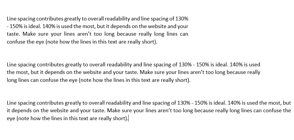
The telltale sign for a DIY website – on any platform is narrow margins. It took me a few years of designing websites to notice this but now it’s the first giveaway to a DIY website. Sure there are times when you go the full width of the webpage, but this should be reserved for full-width sections with beautiful photography. Your text should always be a width that is narrow enough to easily read it without your eyes tiring out. 700 – 800 pixels is best. Read this article from W3 Lab.
Consider optimizing your images to speed up your website. Squoosh is the best resource to optimize images, and can even save you 95% file size without losing much quality. If you find that your site is loading a bit slow, especially your gallery pages then this tip is a must. It makes a huge difference.

Do you want to know the cure for a boring website? Don’t model it after other websites! In fact, Site Culture’s very own site was inspired by a unique blend of a bottle of hand soap purchased at Wegmans, a well-branded can of ‘Pynk’ Yard’s Ale, and the vibes of Terrain. Your website should feel like a really great store that you’re walking through. It should be cohesive from a brand perspective, but it should also be interesting enough that you want to keep browsing.
Another tip is to add in editorial elements to your website. For inspiration, flip through your favorite magazine and tear out your favorite pages, and replicate them using an awesome page-builder like Elementor. This will make your website unique, fresh, and will make you stand out from the crowd. Use a beautiful blend of typography, and include patterns on your website as well for an eclectic look.
Save time and brain-power and consider one of Site Culture’s Sites Made Simple. These websites were all created using non-website inspirations and will give you a designer, professional website in an instant!
You know what screams ‘I’m just in this for the google search rankings?’, adding a bunch of SEO keywords to your content paragraphs. Don’t get me wrong, you need to have your keywords in your content, but make sure it reads well. After all, it’s actual human beings who will be looking for your services, not Google’s bots. We love including those boring SEO keywords in our footers. This way it’s on every page, getting your site indexed, but is not boring to read. Take a look at our website template demos and scroll down to the footer for some examples.
Long gone are the days of short website pages. Now we have a ‘scroll’ culture. We use our phones and scroll endlessly on Instagram and Pinterest, and the latest trend for websites is the same. Don’t be afraid of including lots of content on your website. Seeing long web pages will provide more interest for your visitors, and leave them spending more time on your website.