Green and pink color schemes are timeless combinations that can bring both vibrancy and elegance to any design. Whether you’re working on a digital design project, planning a wedding, or redecorating a room, these color palettes offer a fresh, sophisticated look. Below, we’ll explore seven unique green and pink color schemes, perfect for any occasion.
1. Azalea: Green and Pink Color Scheme
This palette combines soft shades with a vibrant punch. The Ivory (#FAFAF8) and Sage (#CFDFC4) offer a gentle foundation, while the Strawberry (#E5B8CC) and Azalea (#CA2286) add a playful yet bold contrast. The Evergreen (#27391D) grounds the palette, making it perfect for both print and digital projects where a balanced yet striking design is needed.
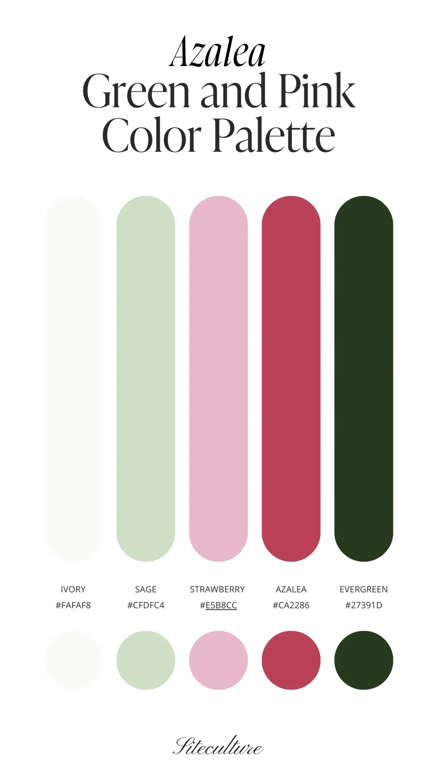
Best Use: This palette is ideal for wedding invitations, branding materials, or interior design in a space that requires a mix of subtlety and statement.
2. Muted: Green and Pink Color Scheme
For a more subdued and elegant approach, the Muted palette provides a soothing combination of Mist (#F2EFF1) and Blush (#DFC9CE) paired with a warm Salmon (#8EA58C). The Sage (#AAB5AA) and deep Evergreen (#1E4C01) add depth without overwhelming the senses.
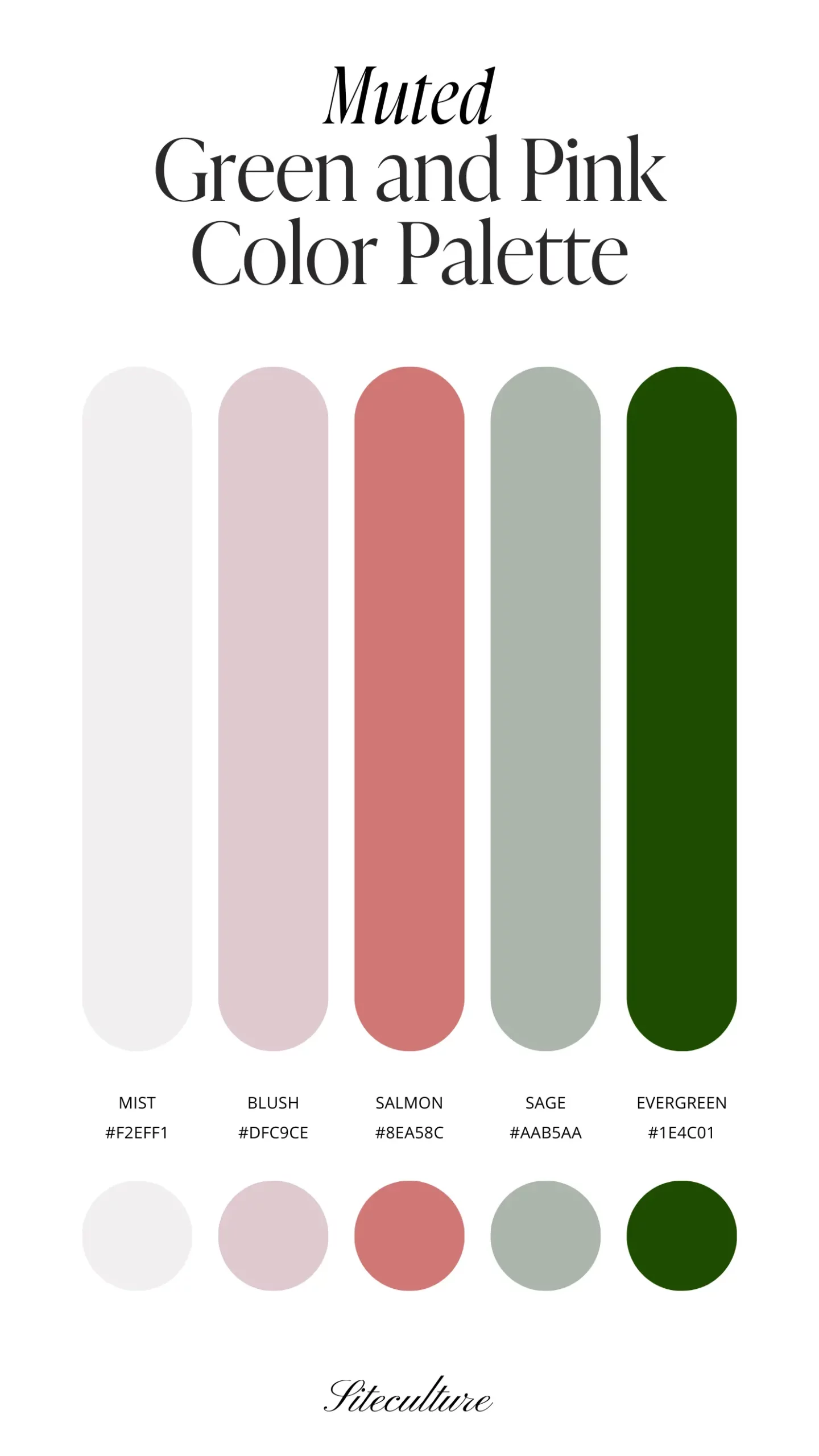
Best Use: This color scheme works wonderfully for printed materials like brochures or business cards, especially in professional or minimalist design settings.
3. Peony: Green and Pink Color Scheme
The Peony palette is all about soft femininity with a hint of earthiness. The Ivory (#F4F3F1) and Blush (#F1CFE1) provide a delicate background, while Peony (#E9839D) injects just the right amount of pink. Sage (#9FA881) and Evergreen (#434D20) complete the palette with a natural, grounded feel.
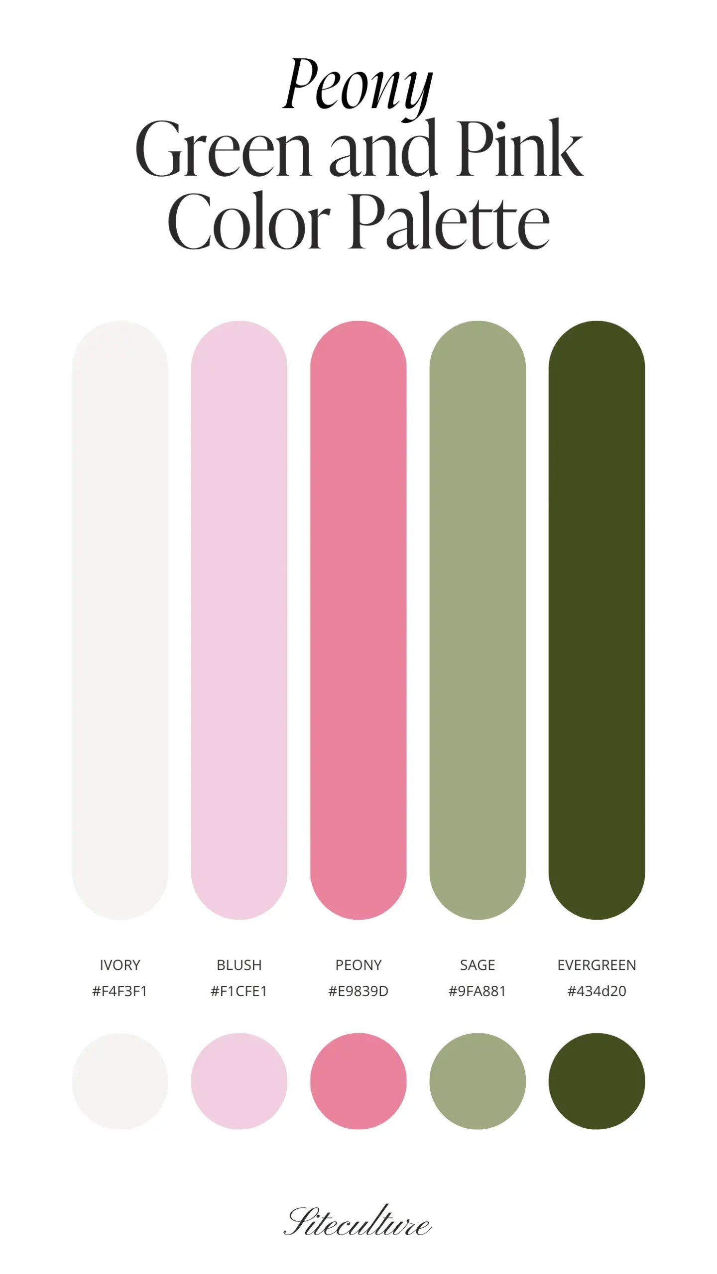
Best Use: Perfect for bedroom decor or any design that requires a light, airy touch with a sophisticated twist.
4. Floral: Green and Pink Color Palette
Floral is a classic palette with a vintage vibe. The Mist (#E8DFE2) and Peony (#D9A9CC) offer a soft, nostalgic feel, while the Rosy Red (#AC2E51) adds a pop of rich color. Sage (#43754A) and Evergreen (#263B11) bring in a darker, more dramatic green, perfect for adding contrast.
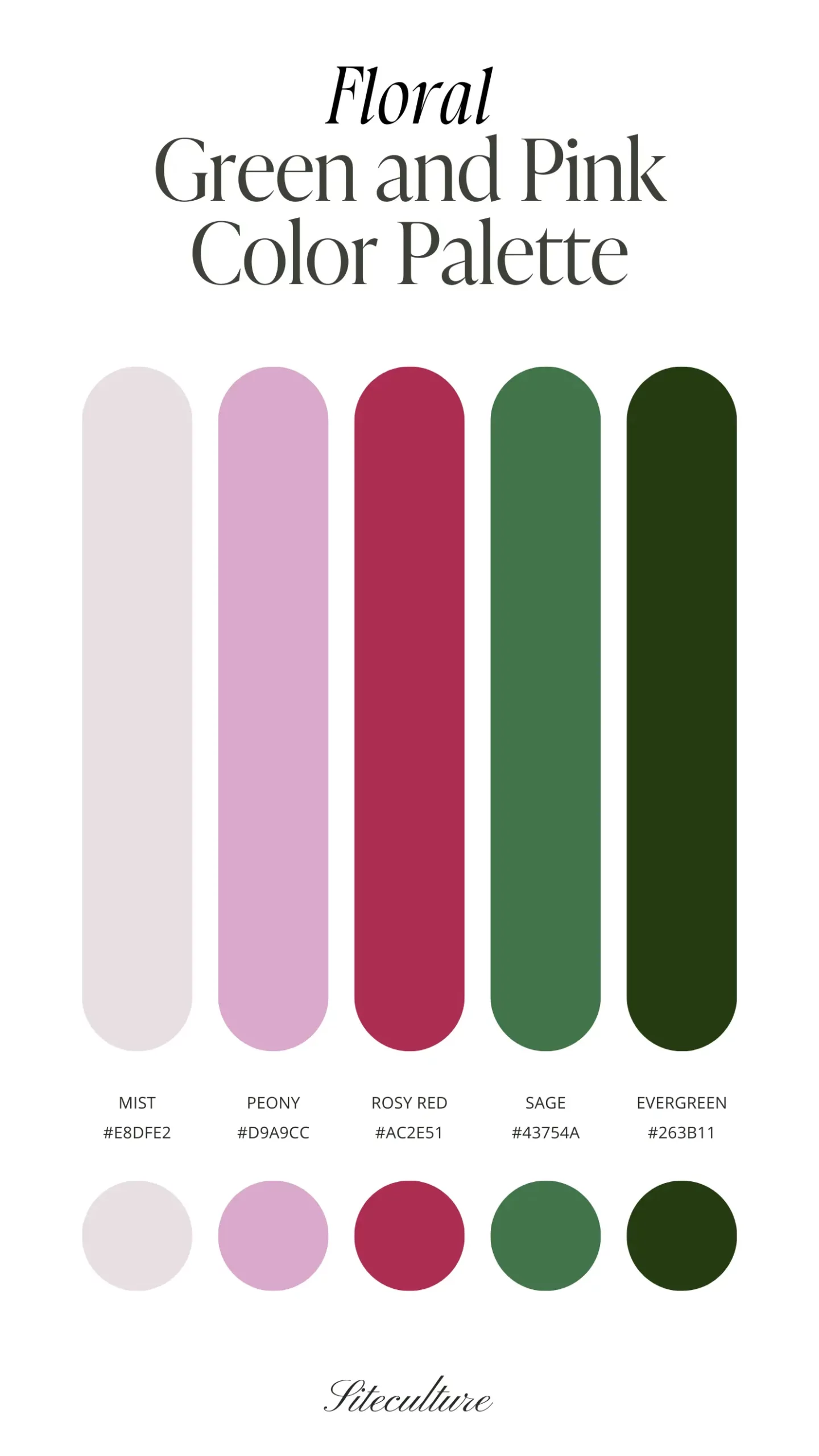
Best Use: Ideal for wedding themes, particularly in floral arrangements or event decor where a romantic, timeless atmosphere is desired.
5. Soft & Feminine: Green and Pink Color Palette
The Soft & Feminine palette blends lightness with warmth. The Mist (#F4F3F1) and Peony (#F2D1D4) are paired with a rich Mauve (#D8959B) and the calming tones of Sage (#829672) and Evergreen (#344C3D). This combination is perfect for designs that need a gentle yet impactful color scheme.
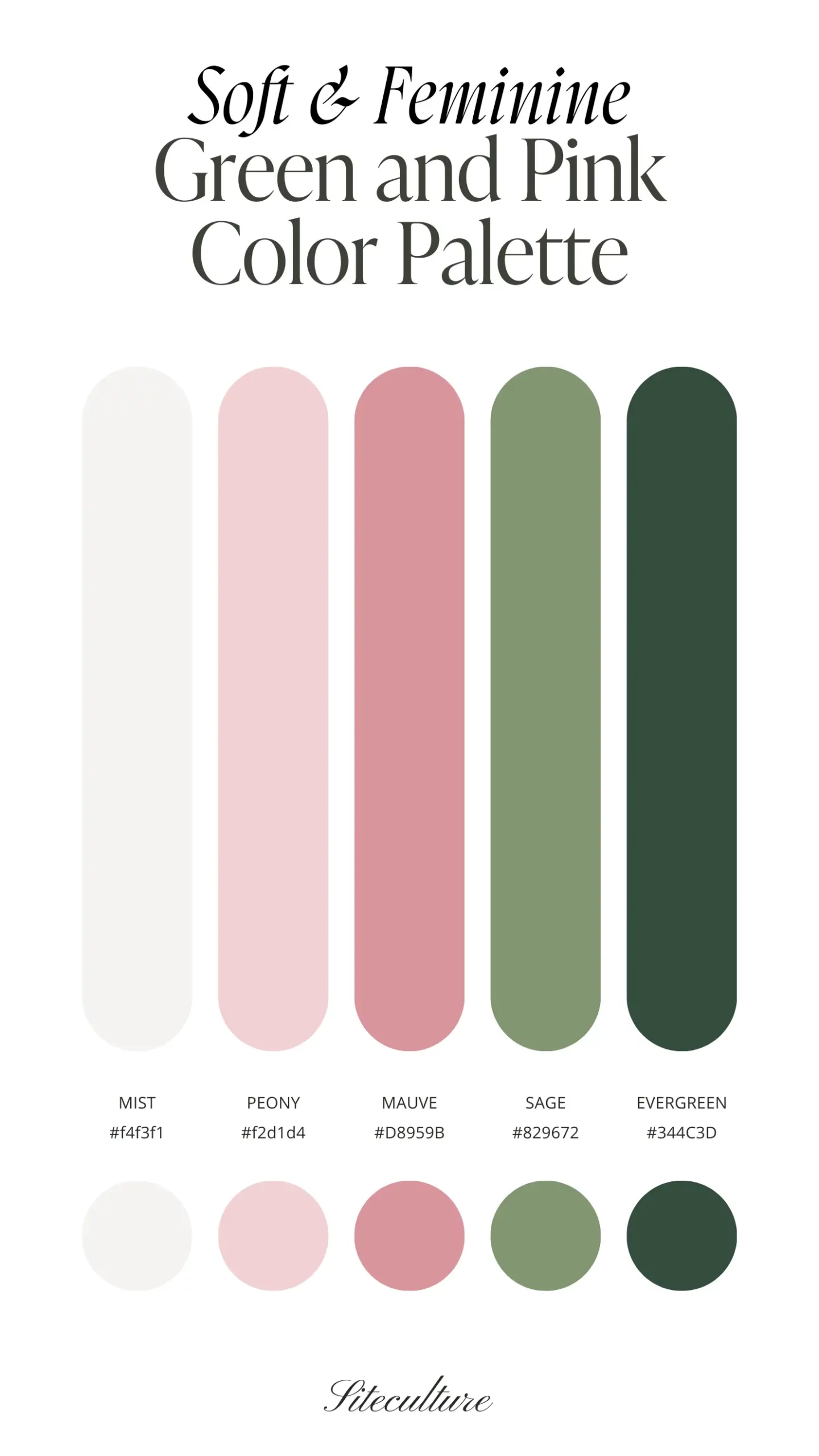
Best Use: This palette shines in digital designs like websites or social media graphics where a soft, welcoming feel is key.
6. Vibrant: Green and Pink Color Palette
For those who love bold and bright (we are looking at you, Lilly Pulitzer lovers), the Vibrant palette is a standout. The Ivory (#FAFAF8) and Light Pink (#FFD0ED) create a clean canvas, while the Hot Pink (#FF66C4) and Kelly Green (#4BBC77) offer eye-catching contrasts. The Ever Green (#255E3B) keeps it all grounded, preventing the palette from feeling too overwhelming.
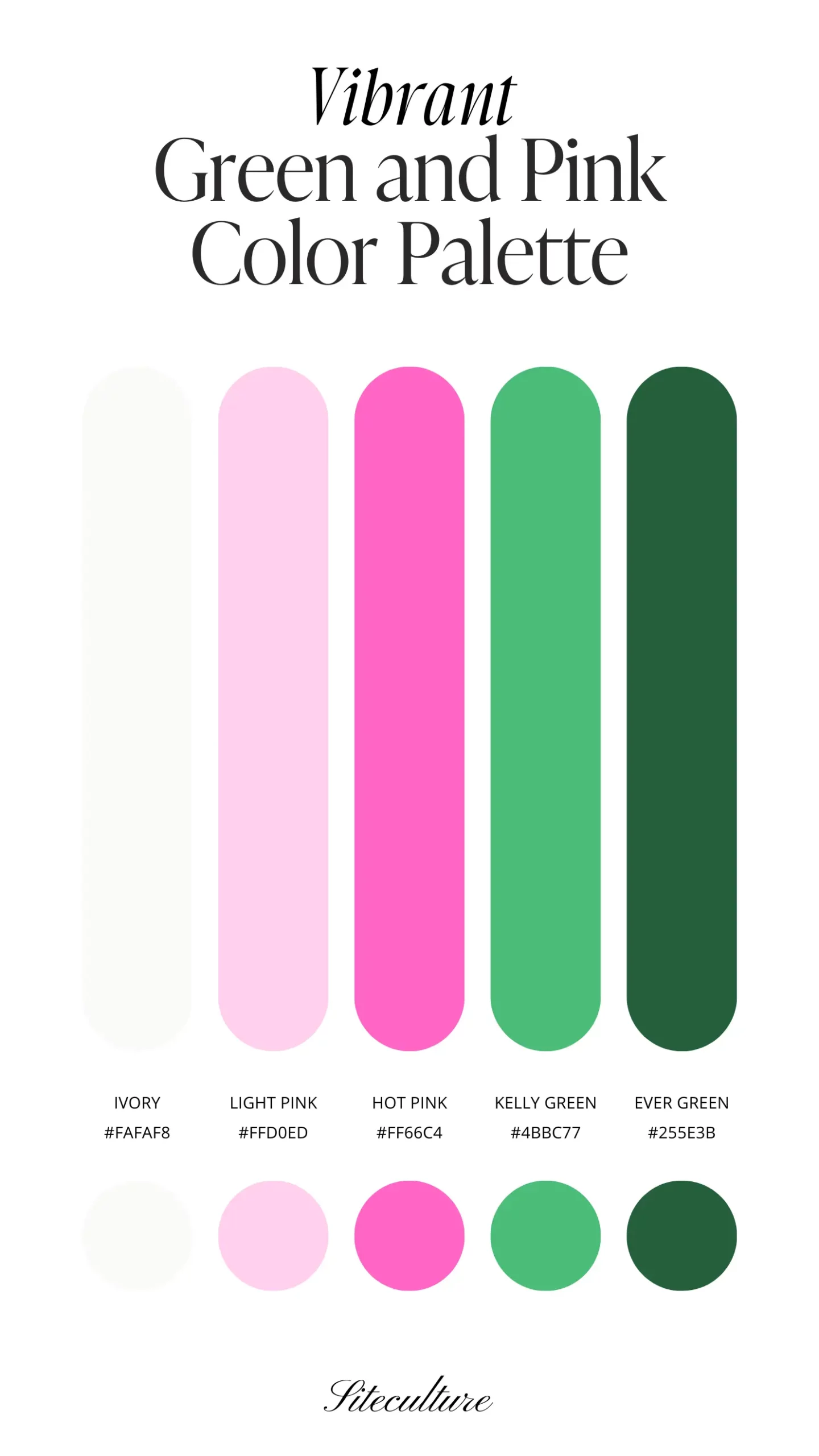
Best Use: Perfect for bold statement pieces like fashion items, advertising materials, or any project that needs to grab attention.
7. Vintage: Green and Pink Color Palette
The Vintage palette combines the soft, nostalgic tones of Cashmere (#EBEAEB) and Light Pink (#DEBFCD) with the rich, earthy Raspberry (#A63B5F). The Olive (#727143) and Dark (#585547) add depth, giving the palette an antique feel.
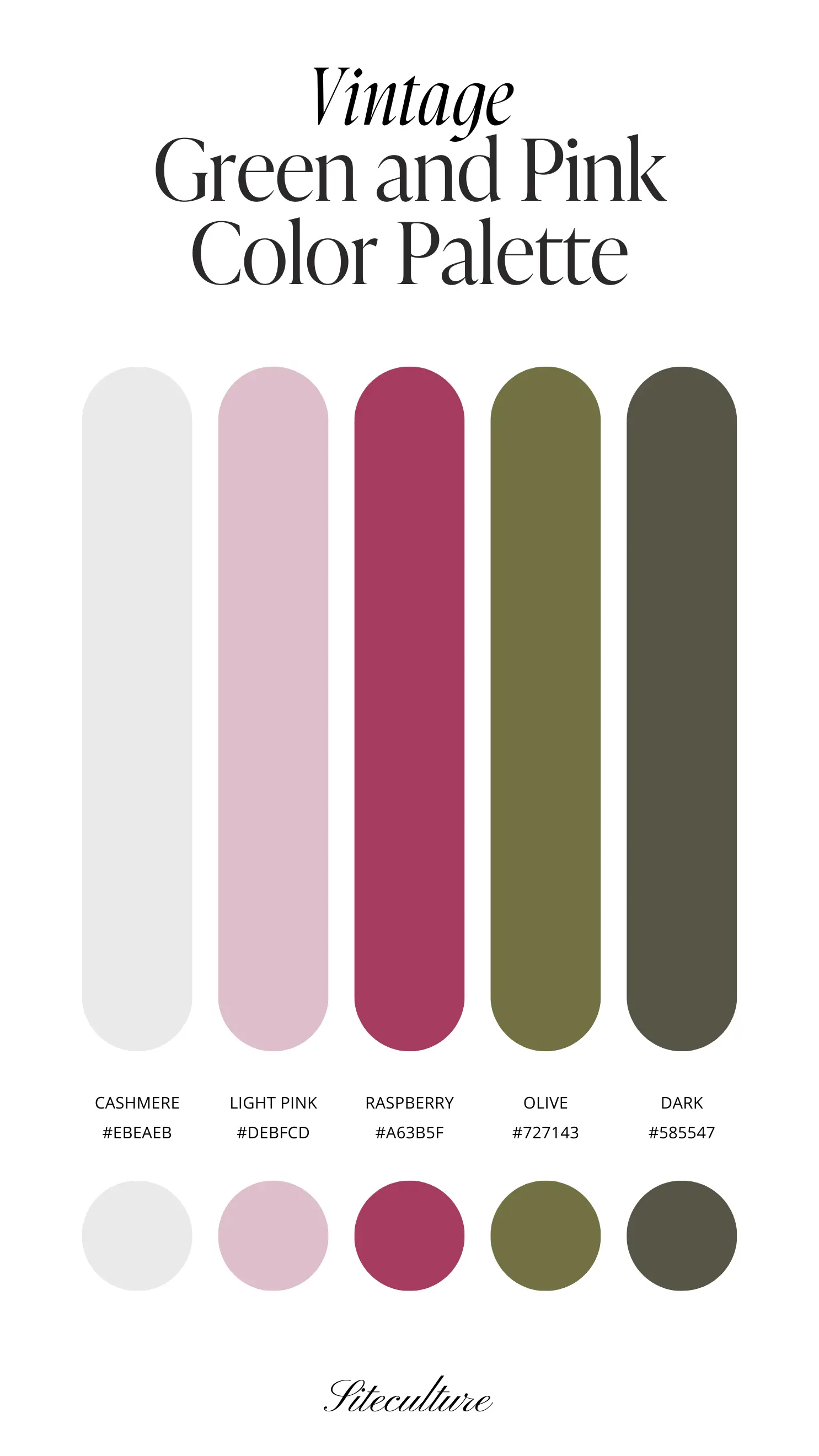
Best Use: Ideal for vintage-themed projects, from wedding decor to branding materials that need a touch of old-world charm.
Join The Canva Archive!
Excited to use these color palettes in your next project? Join The Canva Archive today and gain access to quarterly Color Scheme Drops, a comprehensive Canva Photo Library, and expertly curated Font Pairings. Whether you’re a seasoned designer or just starting out, our archive is your go-to resource for creating stunning, cohesive designs. Sign up now and let your creativity flow!


