Choosing the right font can make all the difference in your design project, especially when aiming for a modern minimalist aesthetic. The perfect font should combine clean lines, versatility, and a touch of sophistication to enhance your brand’s visual identity. In this guide, we’ve curated a list of the top 5 modern minimalist fonts that will elevate your next project, ensuring clarity, elegance, and timeless appeal. Whether you’re working on a logo, website, or marketing materials, these fonts will help you achieve a sleek and professional look that stands out.
The Top 5 Modern Minimalist Fonts For Your Next Project
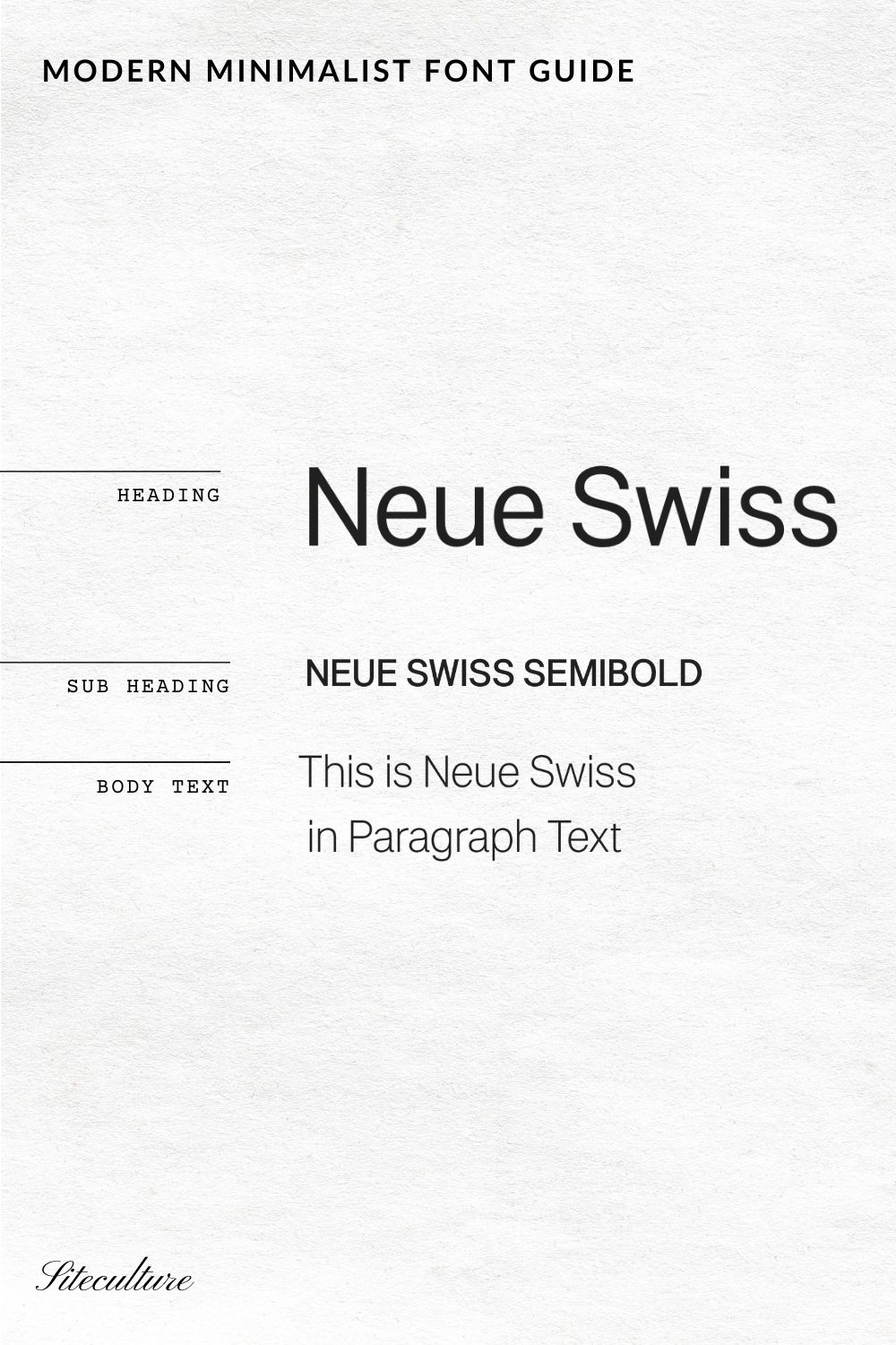
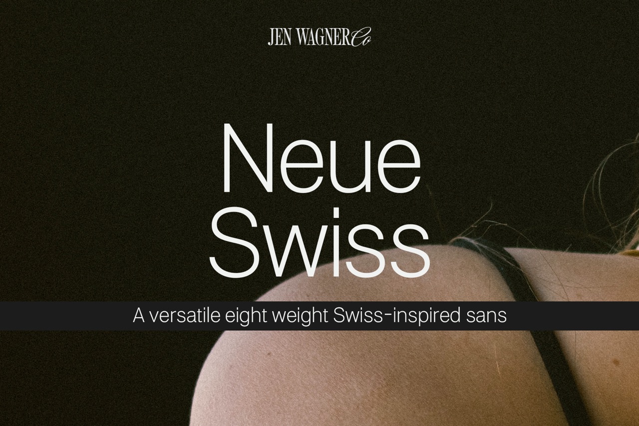
1. Neue Swiss by Jen Wagner
Neue Swiss by Jen Wagner is a font that perfectly embodies modern minimalist design. Its clean, geometric lines and elegant simplicity make it a versatile choice for various branding needs, from website headers to business cards. The font’s exceptional legibility and balanced proportions ensure readability across different mediums, while its timeless appeal guarantees it remains stylish and relevant over the years. Designed by the talented Jen Wagner, Neue Swiss combines beauty and functionality, making it an indispensable asset for creating sophisticated and enduring brands.
What I love most about Neue Swiss is how it manages to be both sophisticated and approachable. Its understated elegance enhances content without overpowering it, aligning perfectly with my commitment to crafting brands that are memorable and celebrated for generations. Whether used for corporate branding or creative projects, Neue Swiss stands out as a reliable and impactful modern minimalist font.
Neue Swiss can be found on JenWagner.com. Use code SITECULTURE for 15% Off
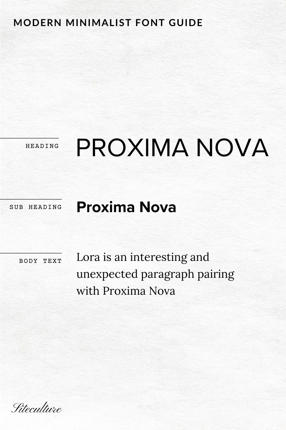
2. Proxima Nova & Lora: A Modern and Free Font Pairing
Proxima Nova and Lora are a dynamic duo that effortlessly combine modernity and classic elegance. Proxima Nova, with its clean, geometric sans-serif design, provides a sleek and contemporary look that’s ideal for headlines and digital media. Its versatility and readability make it a go-to choice for creating a modern, professional aesthetic. Complementing this is Lora, a serif font that brings a touch of timeless sophistication. Lora’s elegant curves and refined details add a sense of warmth and tradition, making it perfect for body text and longer reads.
The beauty of pairing Proxima Nova with Lora lies in their contrasting yet harmonious styles. Proxima Nova’s modern, minimalistic vibe balances perfectly with Lora’s classic, literary feel, creating a visually appealing hierarchy that enhances both digital and print designs. This combination is not only versatile but also ensures readability and engagement, whether it’s for a website, a blog, or a branded print piece. Together, Proxima Nova and Lora provide a balanced, sophisticated aesthetic that elevates any brand.
Proxima Nova can be found on Canva and Adobe Fonts
Lora can be found on Canva and Google Fonts
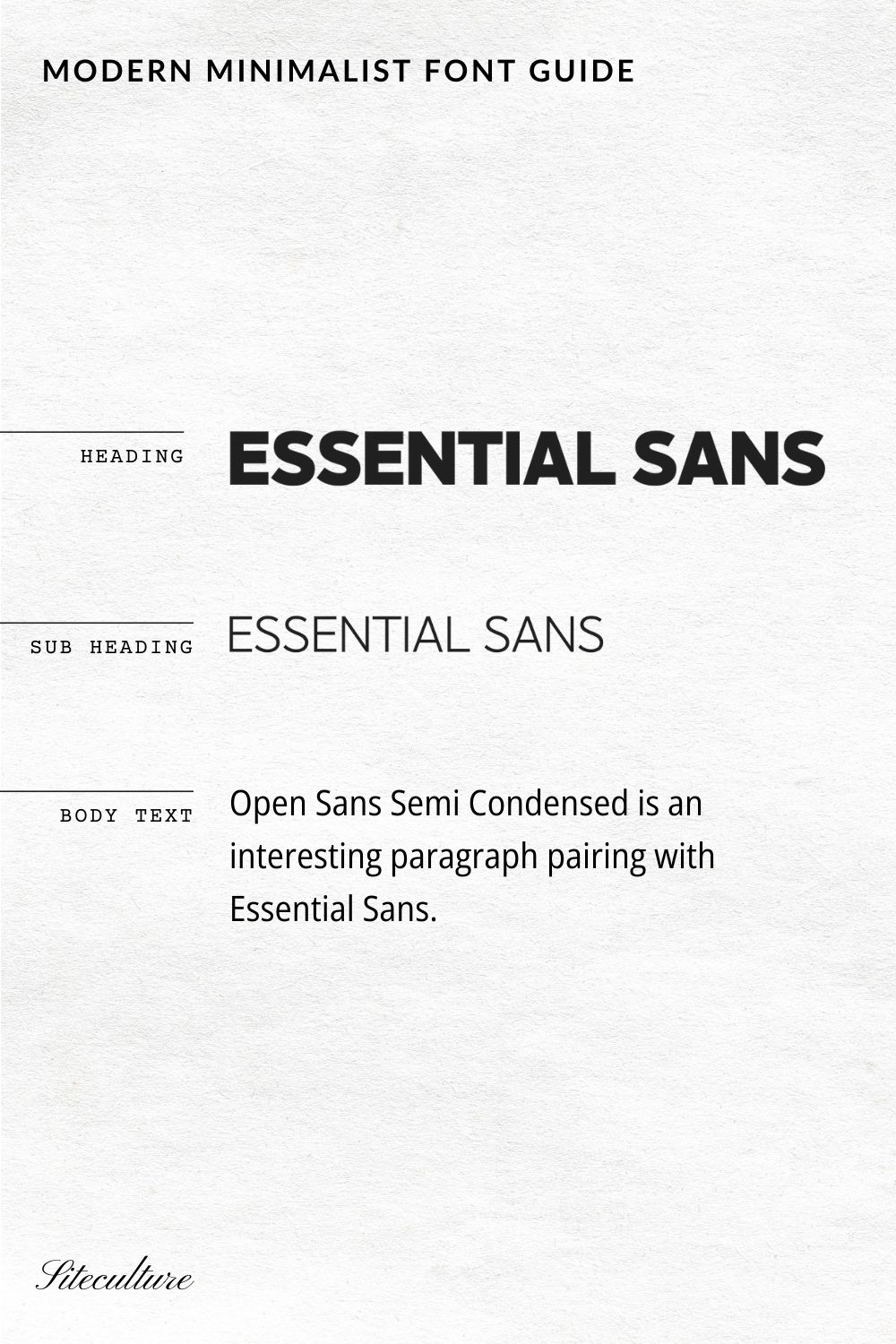
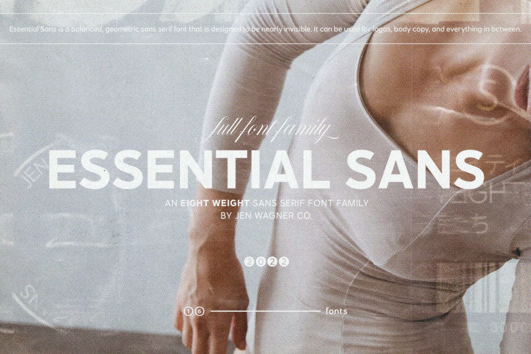
3. Jen Wagner Essential Sans & Open Sans Semi Condensed
The pairing of Jen Wagner’s Essential Sans with Open Sans Semi Condensed creates a harmonious blend of modern sophistication and practical readability. Essential Sans, designed by Jen Wagner, stands out with its clean lines and minimalist elegance, making it an excellent choice for headlines and key branding elements. Its simplicity and clarity give a contemporary and refined touch to any design project.
Complementing this is Open Sans Semi Condensed, a versatile and highly legible font perfect for body text. Its slightly condensed form allows for more text to fit in a given space without compromising readability, making it ideal for longer content and detailed information. The combination of Essential Sans and Open Sans Semi Condensed offers a balanced aesthetic, where the modern appeal of Essential Sans enhances the practicality of Open Sans Semi Condensed, resulting in a cohesive and professional look suitable for various branding and design needs.
Essential Swiss can be found on JenWagner.com. Use code SITECULTURE for 15% Off
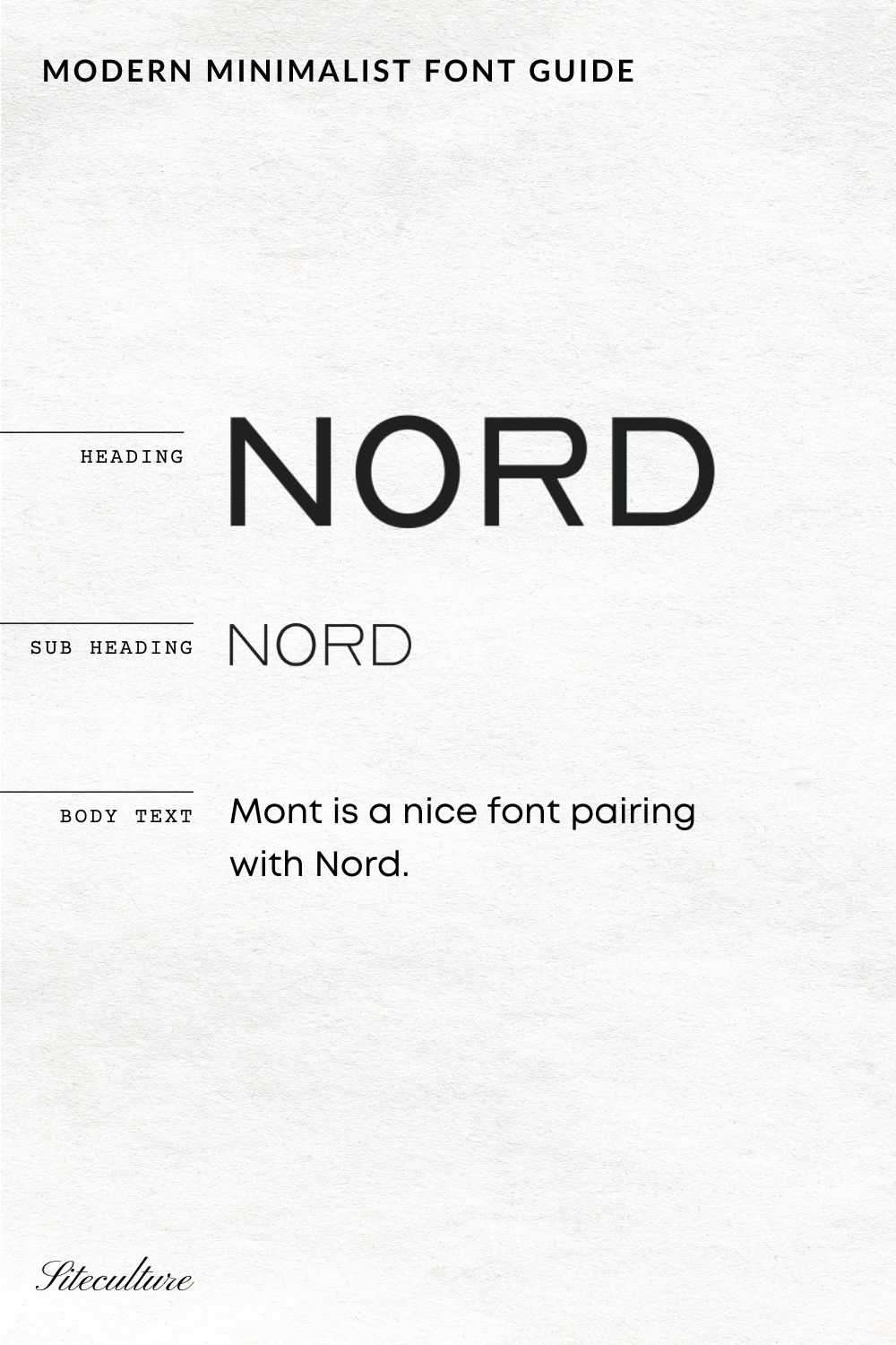
4. Nord Font by Designova
Nord is a minimal and modern sans-serif font family that truly stands out from the crowd. Its all-caps design exudes a bold and confident aesthetic, making it an excellent choice for creating logotypes, branding, headlines, corporate identities, and marketing materials. Whether for web or print, Nord’s sleek and contemporary look ensures that your designs capture attention and convey a sense of sophistication and professionalism.
What sets Nord apart is its efficient letter spacing options, which offer endless possibilities for modern and minimalist designs. This versatility allows for seamless integration into various projects, from logos and headlines to comprehensive brand identities. The font’s clean lines and balanced proportions make it perfect for any type of minimal design, providing a strong visual impact without overwhelming the viewer. The included demo graphics highlight Nord’s capability, showcasing its potential to elevate branding and marketing materials with its distinctive and refined style.
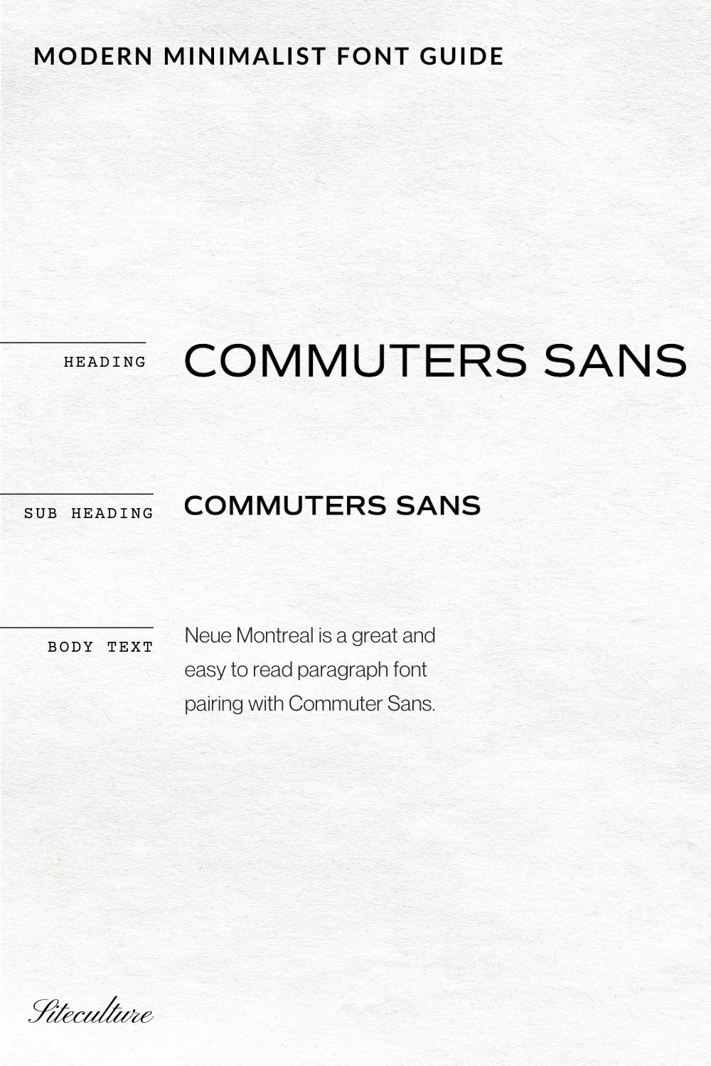
5. Commuters Sans and Neue Montreal
The combination of Commuters Sans and Neue Montreal offers a dynamic blend of modernity and versatility, perfect for contemporary branding and design projects. Commuters Sans, with its clean and straightforward sans-serif design, provides a sleek and efficient look ideal for headlines and key branding elements. Its minimalistic approach ensures clarity and impact, making it a standout choice for modern designs.
Paired with Neue Montreal by Pangram Foundry, a versatile and highly readable sans-serif font, the duo creates a balanced and cohesive aesthetic. Neue Montreal’s slightly more traditional form complements Commuters Sans’s modernity, adding a touch of warmth and approachability to the overall design. This pairing works beautifully for various applications, from web and print to corporate identities and marketing materials. Together, Commuters Sans and Neue Montreal offer a harmonious blend of style and functionality, making them a go-to choice for designers seeking a fresh and effective font combination.
Commuters Sans can be found on Adobe Fonts
Neue Montreal can be found on Canva Pro or can be downloaded for web projects here
What to Look for in a Modern Minimalist Font
Choosing the right font for your brand is crucial, especially when aiming for a modern minimalist aesthetic. Here are key factors to consider:
1. Simplicity and Clean Lines
A modern minimalist font should be simple and devoid of unnecessary flourishes. Look for fonts with clean, crisp lines that convey clarity and precision. Sans-serif fonts are often a go-to choice for their straightforward and unembellished look.
2. Versatility
A good minimalist font should be versatile enough to work across various mediums and sizes. Whether it’s for a website header, business card, or social media graphic, the font should maintain its readability and visual appeal. Fonts like Montserrat and Open Sans are great examples of versatile fonts that work well in multiple contexts.
3. Legibility
Legibility is paramount in minimalist design. The font should be easily readable at different sizes and on various screens. Avoid overly ornate or condensed fonts that can compromise readability. Fonts like Lato and Source Sans Pro strike a balance between style and legibility.
4. Geometric Shapes
Many modern minimalist fonts feature geometric shapes, giving them a balanced and harmonious look. Geometric fonts, such as Futura or Avenir, provide a sense of order and modernity, making them perfect for minimalist designs.
5. Neutrality
Minimalist design often embraces a neutral and understated look. Choose fonts that are neutral in tone, avoiding overly decorative or stylistic elements that can detract from the minimalist aesthetic. Fonts like Helvetica Neue and Proxima Nova are excellent choices for their neutral and timeless appeal.
6. Contrast and Pairing
Consider how the font pairs with others to create a harmonious design. In minimalist design, contrast is often subtle but effective. Pairing a sans-serif font with a serif font, like Gotham and Georgia, can create a balanced and sophisticated look. The key is to ensure that the fonts complement each other without overwhelming the design.
7. Weight and Styles
A good font family should offer multiple weights and styles, allowing for flexibility in your design. Having options like light, regular, bold, and italic can help create visual hierarchy and emphasis where needed. Fonts like Raleway and Roboto offer a wide range of weights and styles to choose from.
8. Timelessness
Finally, look for fonts that have a timeless quality. Trends come and go, but a truly minimalist font should withstand the test of time. Fonts like Baskerville and Lora are classic examples that continue to be relevant in modern design.
Looking for more fonts? Check out these posts:
The BEST Fonts for Websites in 2024: Designer-Approved Picks
Top 5 Retro Fonts on Creative Market – From a Brand Designer
10 of the Best Free Script Fonts on Google Fonts in 2024
The 12 Best Retro Fonts on Canva – Boost Your Brand’s Appeal
Best Aesthetic Fonts on Canva in 2024

