As a brand and web designer, I know how critical font choice is for enhancing your website’s user experience and readability. Fonts not only reflect your brand’s personality but also play a significant role in keeping your audience engaged. Choosing the best fonts for websites can elevate your web design, making your content visually appealing and easy to read.
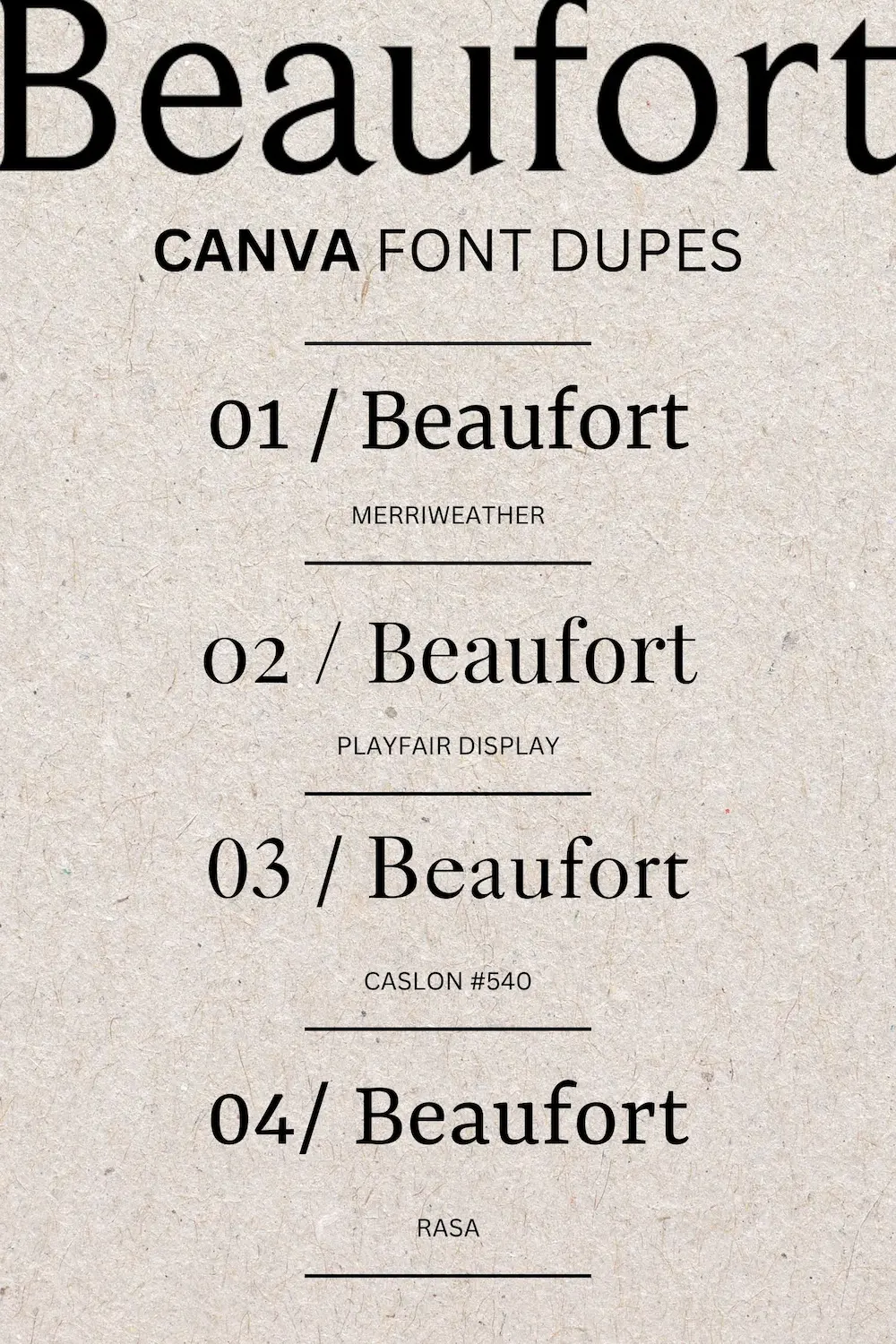
Our posts about the Best Retro Fonts on Canva, Best Retro Fonts on Creative Market, and Best Aesthetic Fonts on Canva have been so popular, that we are following up with this Best Fonts For Websites in 2024 post. When it comes to typography in web design, some fonts truly stand out, and we are diving into the best fonts for your website in this post.
Selecting the right web fonts is essential for crafting a user-friendly online experience. While I do include some neat retro script fonts in my previous posts, I do not actually recommend them for my web design clients! I’d save those fun fonts for logos and brand embellishments instead.
5 Font Pairings for Your Website
Best Fonts for Websites with a Classic Aesthetic
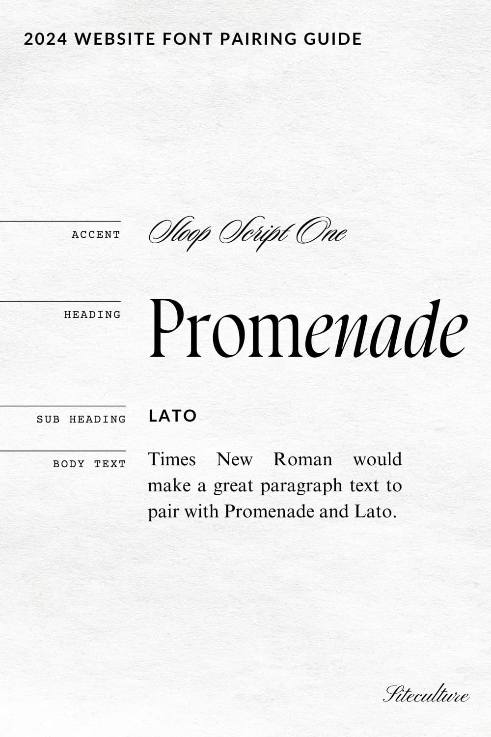
Sloop Script One can be found on Canva, Adobe Fonts or downloaded from Type Network
Promenade can be found on JenWagner.com. Use code SITECULTURE for 15% Off
Lato can be found on Google Fonts, Adobe Fonts, or Canva.
Times New Roman can be found on Canva, most web editors, or downloaded here.

Best Fonts for Websites with a Feminine Aesthetic
For a brand or website with a romantic, feminine aesthetic, I recommend a delicate script accent font of Lucia Regular. Editor’s Note is a classic that looks beautiful, clean, yet feminine. Open Sans makes a reat sub heading to keep it feeling fresh, and PT serif for the body text is easy to read in web browsers.
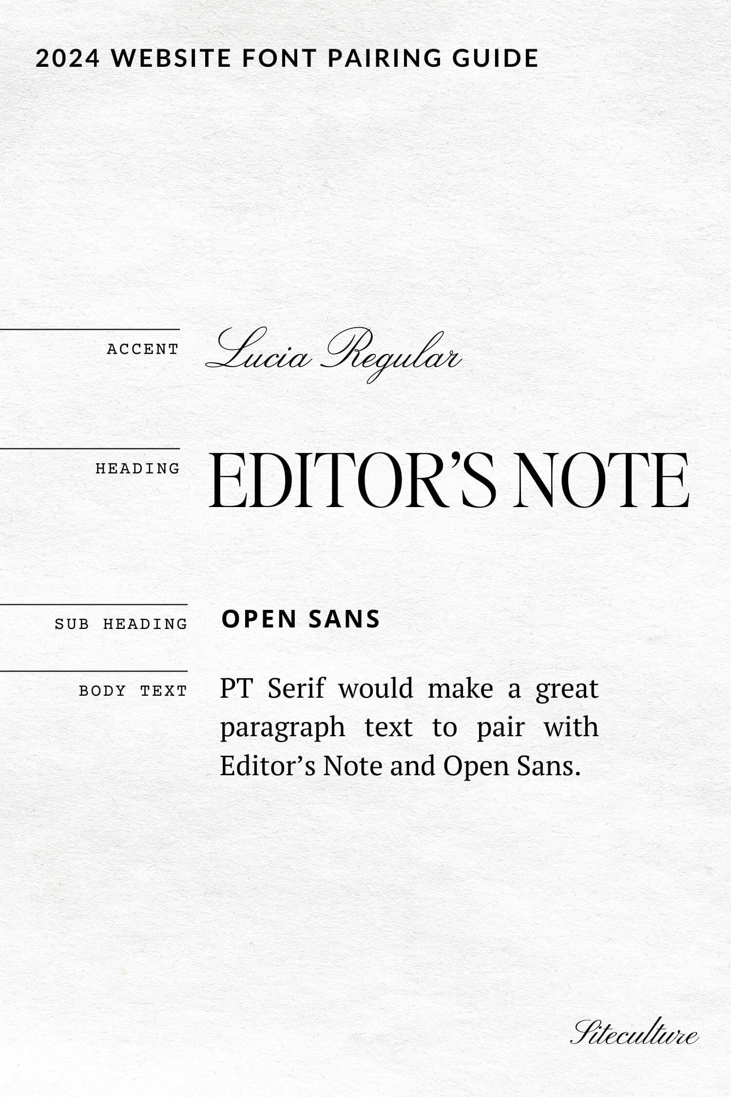
Lucia Regular can be found here.
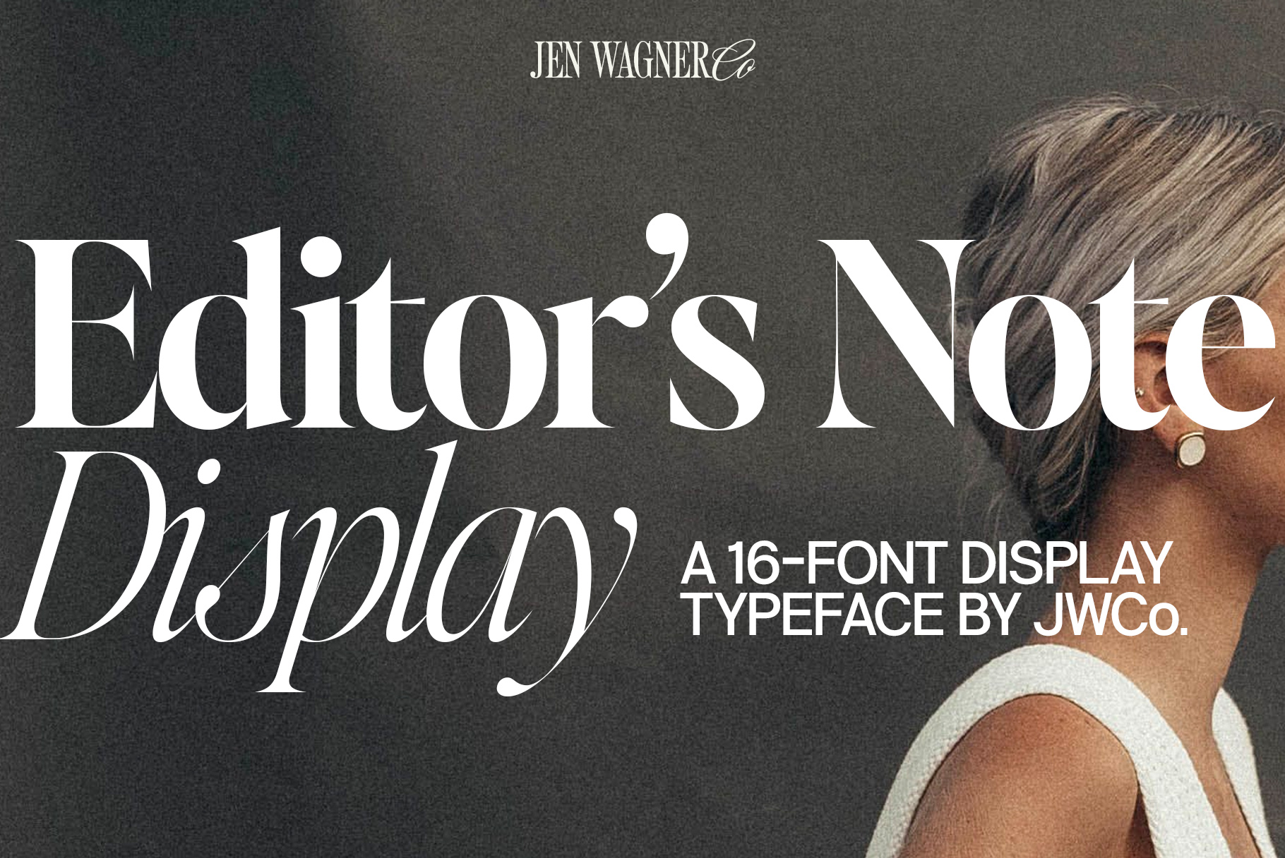
Editor’s Note can be found on JenWagner.com. Use code SITECULTURE for 15% Off
Open Sans can be found on Google Fonts, Adobe Fonts, or Canva.
PT Serif can be found on Google Fonts, Adobe Fonts, or Canva.
Best Fonts for Websites with a Vintage Aesthetic
For a brand or website with a vintage, or nostalgic aesthetic, I recommend Avantime. Aquafina Script is a fun pairing and open sauce adds a clean, easy to read font for sub headings and paragraphs.
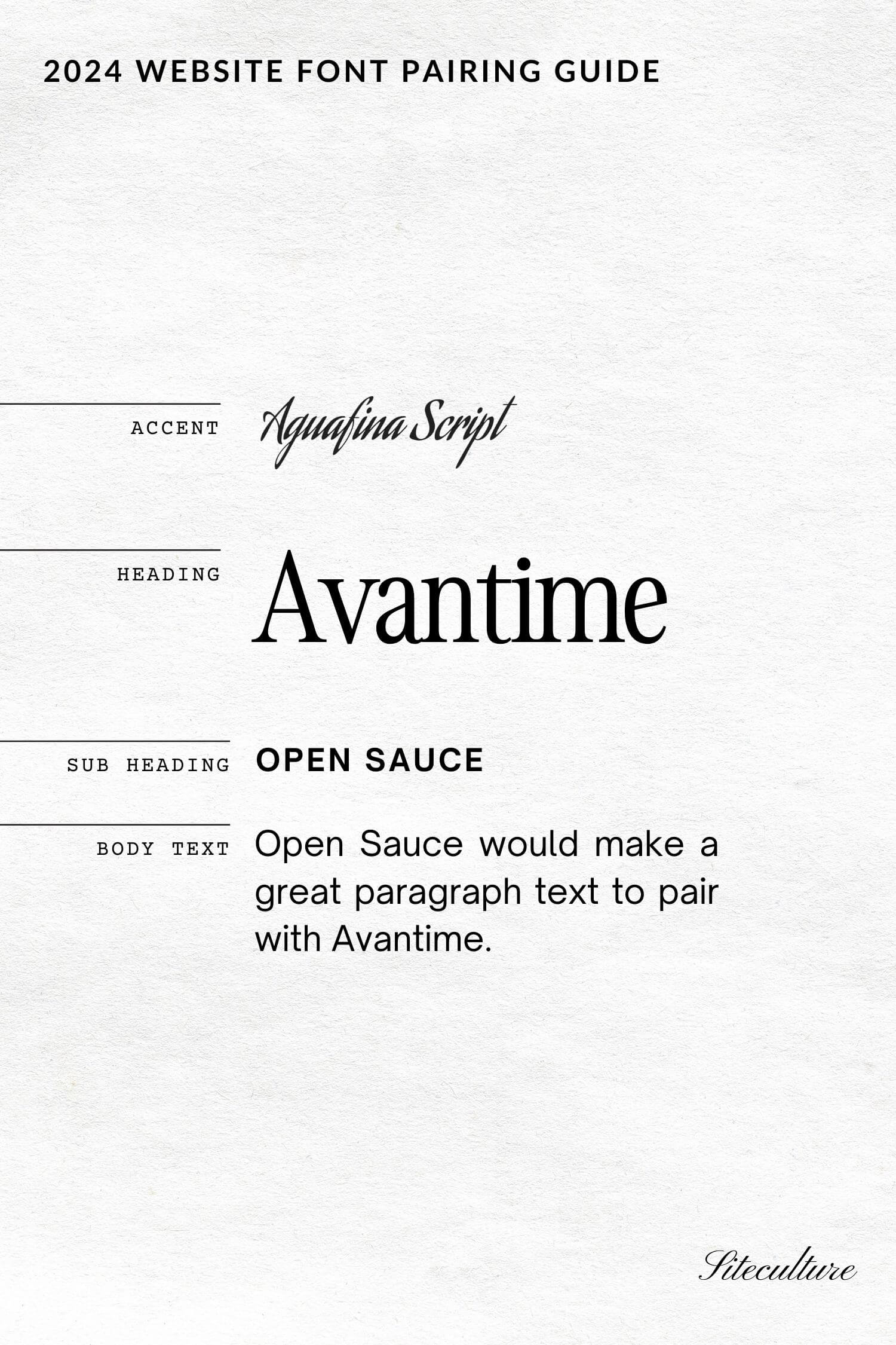
Aguafina Script can be found on Google Fonts
Avantime can be found on Creative Market
Open Sauce can be found on Canva, or downloaded here

Best Fonts for Websites with a Retro Aesthetic
For a brand or website with a retro aesthetic, I recommend Awesome. The italic light version of awesome makes a nice accent to the bolder version. Oakes Grotesk adds a nice, clean, easy to read font for sub headings and paragraphs.
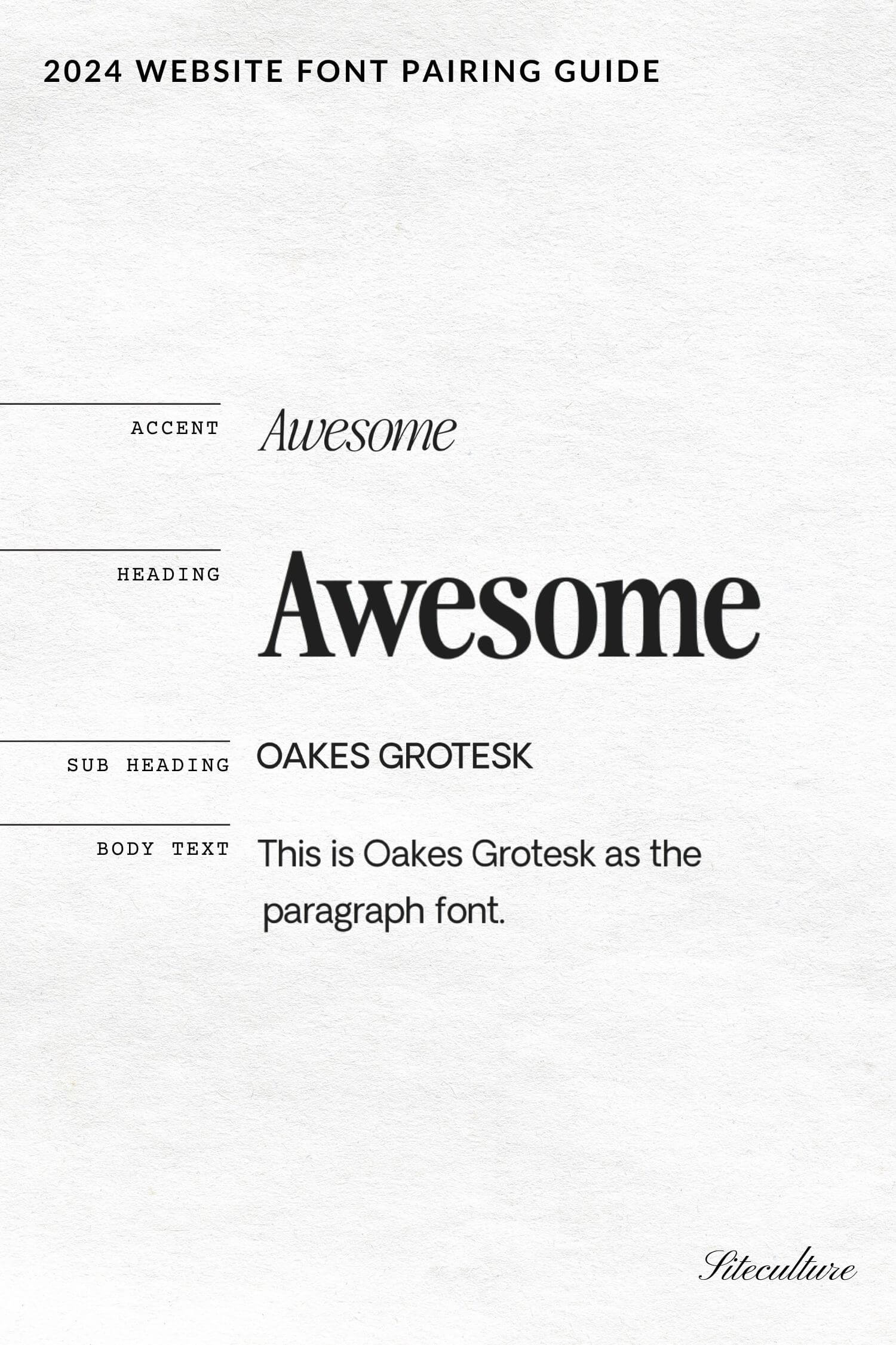
The Awesome Serif can be found on Creative Market
Oakes Grotesk can be found on Creative Market
Best Fonts for Websites with a Modern Classic Aesthetic
For a brand or website with a modern classic aesthetic, I recommend a bold Open Sauce paired with a classic script such as Nautica Script. The italic light version of editor’s note display makes a nice accent to the bolder, punkier Open Sauce.
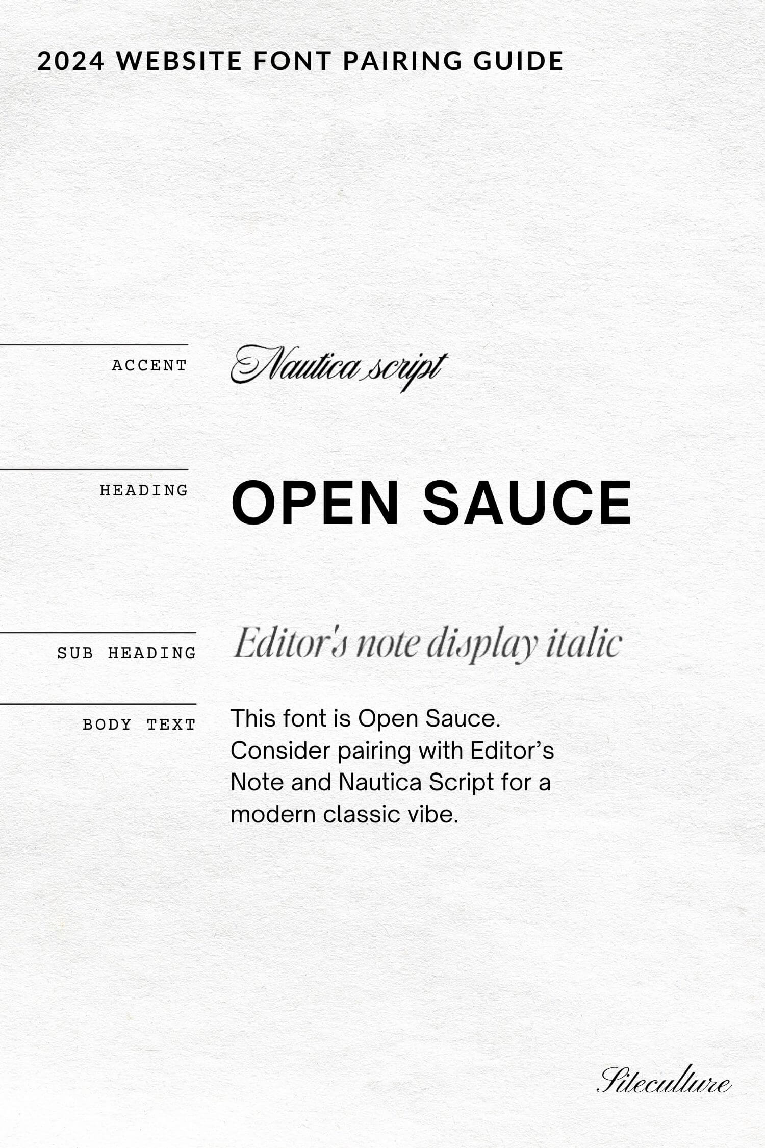
Editor’s Note can be found on JenWagner.com. Use code SITECULTURE for 15% Off
Nautica Script can be found on Adobe Fonts
Open Sauce can be found on Canva, or downloaded here
Grab the 2024 Canva Font Guide
Understanding Typography in Web Design
There are a few key elements to keep in mind when choosing the best fonts for your website.The ultimate goals are to create a seamless user experience and make content readable across various devices and browsers.
The Role of Typefaces in User Experience
A serif font like Times New Roman can convey a formal, traditional feel, while a sans-serif typeface such as Arial or Helvetica gives a modern, clean look.
Legibility is critical. If visitors can’t easily read your content, they will likely leave your site. Using fonts with clear, distinct letters improves readability. This is especially important for body text, where simpler fonts like Verdana and Georgia are often more comfortable to read.
Visual hierarchy is also essential. Headings should stand out from the body text, guiding users through your content naturally. For example, using a bold sans-serif for headings and a readable serif for body text can create an effective and engaging design.
Essential Font Considerations for Devices and Browsers
Choosing the right font involves considering how it will look across different devices and browsers. What looks great on a desktop may not be as readable on a mobile device. Responsive design ensures that your typography adapts to various screen sizes and resolutions.
Browsers handle fonts differently. Some may not support specific fonts, leading to inconsistencies in your design. Using web-safe fonts or implementing fallback fonts can help maintain a consistent appearance. For example, pairing a custom font with a similar web-safe equivalent ensures your site looks good even if the custom font fails to load.
Operating systems can also affect how fonts are rendered. Always test your fonts on multiple platforms, including Windows, macOS, iOS, and Android, to verify they look as intended.
By focusing on these things, you can create a gorgeous and user-friendly web design that stands out in today’s competitive digital landscape.
Selecting the Right Fonts for Website Aesthetics and Branding
Choosing the right fonts for your website is crucial for conveying your brand’s personality and appealing to your target audience. It involves a careful balance between aesthetics and readability.
Matching Fonts with Brand Personality and Target Audience
First, it’s important that your font reflects your brand’s personality. For example, serif fonts can give a traditional, trustworthy feel, perfect for law firms or financial institutions. On the other hand, sans serif fonts look modern and clean, making them ideal for tech companies or creative agencies.
Consider your target audience. If your brand is aimed at younger people, playful and bold fonts might be appropriate. For a professional audience, a classic font might be a better choice. Knowing your audience will help you make more informed decisions about font styles.
Incorporating Versatile and Aesthetically Pleasing Typeface Options
Versatility and aesthetics are key when selecting fonts. Fonts like Open Sans are widely used because they are readable and functional across various devices. They are great for body text, keeping your site looking clean and accessible.
Pairing fonts is also important. For headings, you might choose a more distinctive font to catch the eye, while for body text, something straightforward ensures readability. Make sure your chosen fonts complement each other well to maintain visual harmony.
Balancing Font Styles for Visual Appeal
Balancing different font styles involves mixing and matching without creating visual clutter. Using too many different fonts can make your website look chaotic. A good rule of thumb is to stick to 2-3 fonts: one for headers, one for body text, and possibly one more for special emphasis.
Contrast is essential for visual appeal. Combine a bold, expressive font for headings with a simple, minimal font like Roboto for body text. This combination will make your content easy to scan and visually engaging.
Remember, your font choices can significantly impact your website’s overall look and feel. Taking the time to select the right ones will help you create a cohesive and attractive online presence.
Optimizing Typography Performance and Accessibility
As a brand designer, one of my top priorities is to ensure that typography on a website is both high-performing and accessible to all users. This involves selecting the right fonts, ensuring compatibility across different devices, and weighing the pros and cons of free versus commercial font options.
Choosing Web-Safe and Readable Fonts for All Users
Selecting fonts that are both web-safe and readable is crucial. Web-safe fonts like Arial, Helvetica, and Times New Roman are reliable as they are pre-installed on most devices. These fonts ensure that your content displays consistently across different platforms.
Fonts play a key role in readability. Options like Tiresias and OpenDyslexic are designed to support better reading experiences for individuals with dyslexia. For general readability, fonts like Lato and Montserrat are highly recommended.
When pairing fonts, I usually match a serif font for headlines with a sans-serif font for body text to create a visual hierarchy. This helps in guiding the reader’s eye and improving the overall readability of the content.
Ensuring Compatibility Across Different Screen Resolutions
Ensuring that your fonts look good on various screen resolutions is another key aspect. Responsive design is essential. Fonts need to scale well across devices, from mobile screens to large desktop monitors.
Higher resolution displays benefit from vector-based fonts which retain their crispness when scaled. Web fonts should adapt well to both low and high-resolution displays, ensuring that text remains clear and legible on all devices.
Browsers delay text rendering until a web font is fully loaded, which can affect performance. Using font-display: swap; in your CSS can counteract this by showing fallback text until your custom web font loads, ensuring that the user experience is not interrupted.
Accessing High-Quality Fonts: Free vs. Commercial Use
When it comes to sourcing high-quality fonts, I weigh the benefits between free and commercial offerings. Google Fonts is an excellent resource for free fonts. Fonts like Roboto, Open Sans, and Lato are widely used and highly regarded.
Commercial fonts from services like Adobe Fonts offer a premium selection tailored for professional use. The cost often includes licensing and support, which can be crucial for client projects.
While free fonts are accessible and easy to use, commercial fonts can offer better variety and quality. Balancing the budget with the need for a professional look is essential in choosing the right font for your project.
Practical Guide to Font Selection and Implementation
Choosing the right fonts for your website is essential. It helps guide user attention, improve readability, and enhance overall design.
Best Practices for Using Serif and Sans-Serif Typefaces
When selecting fonts, I often choose between serif and sans-serif typefaces. Serif fonts, like Times New Roman and Georgia, have small lines at the end of characters. They are great for enhancing the elegance of your site and are often used in body text for printed materials. But on digital screens, they might be harder to read, particularly at smaller sizes.
Sans-serif fonts, such as Arial and Helvetica, lack those extra lines. They are clean and modern, making them perfect for websites. They are typically easier to read on screens, making them excellent for body text and headers. When I choose fonts for client websites, I often stick to sans-serif for body text and may use serif fonts for headers to create a sophisticated look.
Effective Font Pairing Strategies
Effective font pairing is crucial in web design. I like to pair a bold, expressive header font with a clean, readable body font. For example, combining a decorative script font for headers with a straightforward sans-serif font for body text can create a balanced visual hierarchy.
When selecting font pairs, consider contrast in weight and style. Fonts should complement each other but also stand out enough to create visual interest. Using a tool like Google Fonts can help you find open-source fonts that pair well together. Remember to limit the number of fonts you use to avoid a cluttered look—usually, two to three different typefaces are sufficient for most websites.
By thoughtfully pairing fonts and choosing the appropriate types for different sections, you can effectively guide your users and enhance their experience on your site.