When it comes to website copy, the stakes are high. Think of your website like a digital office or storefront. If a first-time customer walks into your business, your verbal and non-verbal communication defines their impression of your brand. It works the same way online. A clearly-crafted message, supported by a consistent tone, voice, and visual design, builds a higher-quality connection with customers and invites them to explore further. On the other hand, dense or unclear web copy will send the reader off to look for a more positive, enjoyable experience elsewhere.
Not to mention, the physical world tends to offer more chances to create positive experiences—whether it’s staff to guide customers, welcoming decor, or free samples. Unfortunately it can be tough to create these interactions virtually.
In the digital realm, your website—messaging, visuals, and structure—represents the end-to-end experience. That means it’s even more important that it is built to engage and delight customers. At Site Culture, we’re experts in all these key areas, but in this blog, we’ll focus on the messaging.
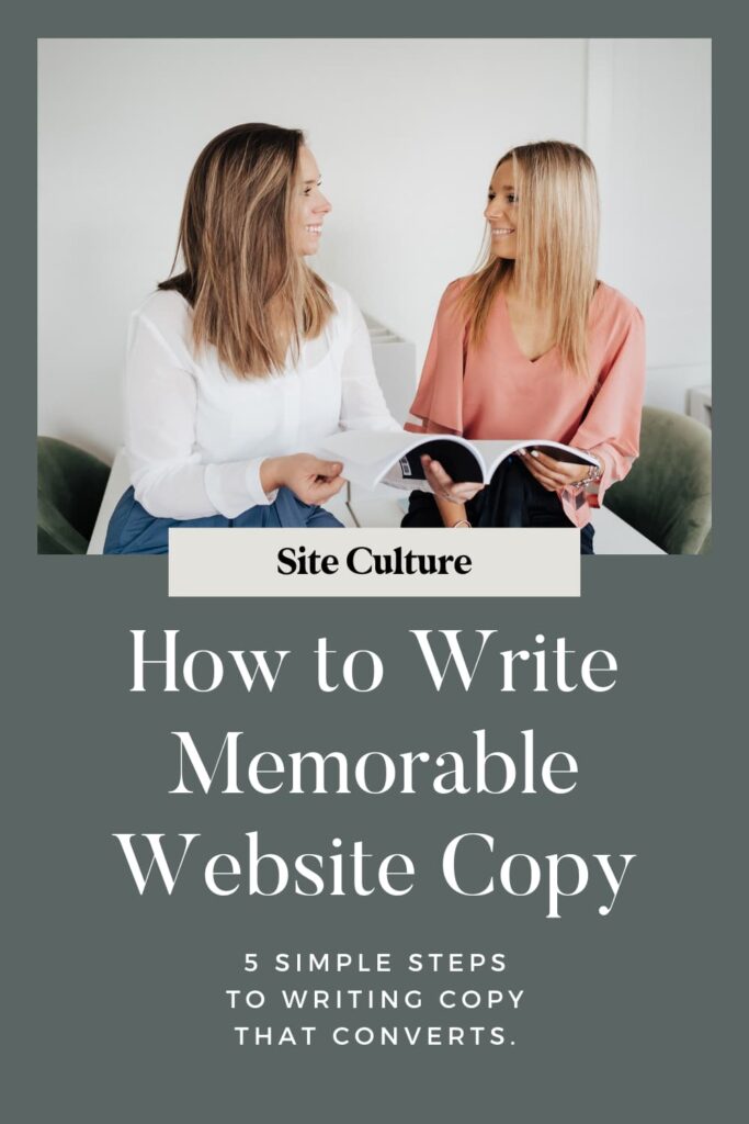
Below are our top five tips for compelling website copy that creates a memorable, engaging customer experience.
- Write like you’d talk to a friend. Not only does a conversational tone make your business more approachable and welcoming, but it also increases the likelihood that you’ll get your point across. Eliminate unnecessary words, use active voice, and avoid run-on sentences. As you’re writing, think about the topic and ideas as if you’re speaking them out loud. Strive to get those thoughts on paper.
- Shorter is often better. Think about the visual appearance of your copy to readers. Try to keep paragraphs no longer than five sentences (tops). It can feel onerous or cumbersome to see dense blocks of text—instead, keep things brief and make it super simple for readers to pick up the message you want to convey.
- Walk in the customer’s shoes. If someone is visiting your website, chances are they have a challenge or need that you might be able to help them address. Craft your messaging in a way that conveys your understanding of that challenge. After all, meeting your customers’ where they are is a sure-fire way to pique their interest. Consider a traditional story arc when building your website copy: (1) hook your readers with detail on their challenge, (2) engage your readers with a fresh perspective on the challenge, and then (3) prove how your offerings and services can help.
- Be choosy about your words. With a limited amount of space to tell your story, make sure that every word serves a purpose in your message. Consider incorporating key words (search terms) that potential customers might use to locate your business, or businesses like yours. It’s a win-win: your SEO improves and customers find what they need.
- Be strategic about hierarchy of terms. We all know that attention spans are shorter than ever. For the (likely growing) volume of customers skimming your website, consider how you can make use of headlines, sub-headlines, and body copy to organize your key messages. For instance, put your boldest and most critical messages in headlines and sub-headlines—the right ones leave a lasting impression on customers, even with one glance. Place supporting details in the body copy for those who are interested reading further (and if you did a good job writing the headlines, chances are they will be).
All of Site Culture’s website templates come with a tailored writing guide that guides and prompts you through the website copy creation process. Learn more about our templates here.


