Creating a luxury brand that resonates with both sophistication and timelessness is an art form. One of the most crucial elements in this process is selecting the right color palette.
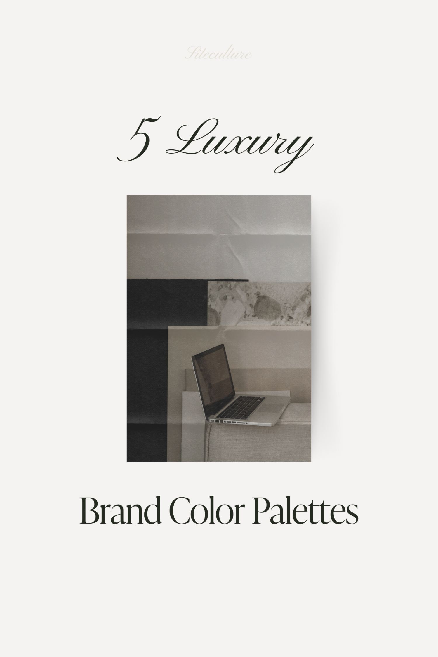
Selecting the Best Luxury Brand Color Palette for your Business
The colors you choose not only define the visual aesthetics of your brand but also evoke emotions and set the tone for customer interactions. Here, we’ll explore how to develop a luxury brand color palette that embodies elegance and stands the test of time, ensuring your brand not only stands out but thrives with authenticity and longevity.
Understanding the Psychology of Colors to select the best color palette for your luxury brand
Colors have the power to influence perceptions and behaviors. In the realm of luxury brands, your color palette must reflect prestige, quality, and a timeless charm. Colors like deep blues and rich burgundies convey trust and reliability, while metallic tones such as gold and silver evoke feelings of opulence and high value. Soft neutrals like charcoal, beige, and ivory are celebrated for their versatility and can help create a clean, modern look that appeals to a discerning audience.
The Classics that can be added to any luxury brand color palette: Black and White
No discussion of luxury brand color palettes would be complete without mentioning the quintessential combination of black and white. This duo is the epitome of elegance and simplicity, offering a striking contrast that captures attention while maintaining an unmatched sophistication. Utilizing black and white in your branding can communicate a bold yet understated luxury that is both modern and timeless.
Incorporating Metallics for a Touch of Glamour
Metallic colors like gold, silver, and bronze add a layer of luxury and are often associated with premium quality. These colors can be used as accents to draw attention to your logo or as primary elements in your overall design to elevate the perceived value of your brand. The key is to use metallics judiciously to maintain elegance without overwhelming the senses.
Choosing Colors with Longevity
When selecting colors for a luxury brand, it’s crucial to think long-term. Trendy colors can be tempting, but they may not stand the test of time. Opt for hues that have consistently been associated with luxury, such as navy blue, emerald green, and deep burgundy. These colors not only convey a sense of wealth and stability but also ensure that your brand remains relevant across different eras.
Testing and Feedback
Before finalizing your color palette, test it across various mediums. How do these colors look on digital platforms versus print? Do they convey the luxury feel you’re aiming for in all formats? Gathering feedback from your target audience can provide invaluable insights and help refine your color choices to better align with their expectations and your brand values.
5 Luxury Brand Color Palettes For Your Next Project
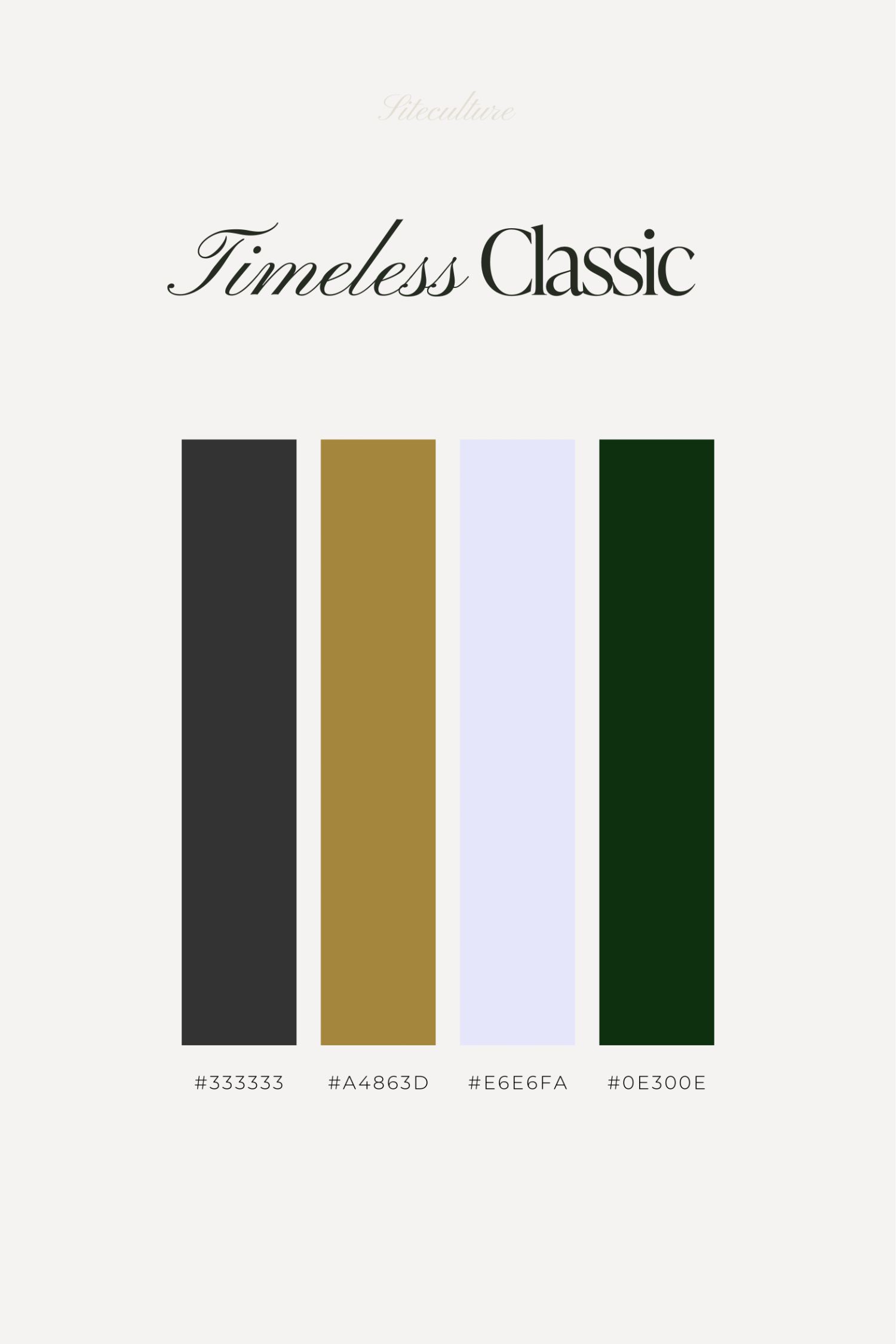
1. The Timeless Classic
Black and gold, it’s the duo that’s stood the test of time—no fuss, just pure class. With black’s depth and gold’s glow, this palette is the business suit of color schemes: always appropriate, forever chic. Throw in a touch of ivory and a dash of green, and you’ve got a palette that’s as reliable as your favorite watch.
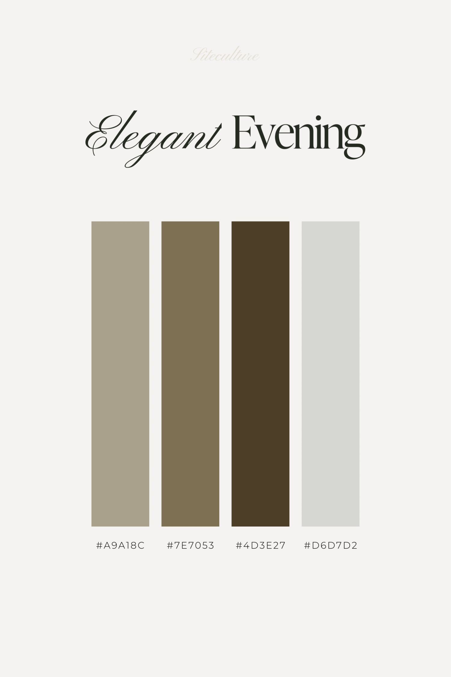
2. Elegant Evening
Picture this: twilight, a subtle breeze, and a palette that’s as sophisticated as your evening plans. It’s a quiet conversation starter. Taupe, olive, brown, and a hint of grey create an aura of understated luxury that’s perfect for those who speak softly but carry a big stick.
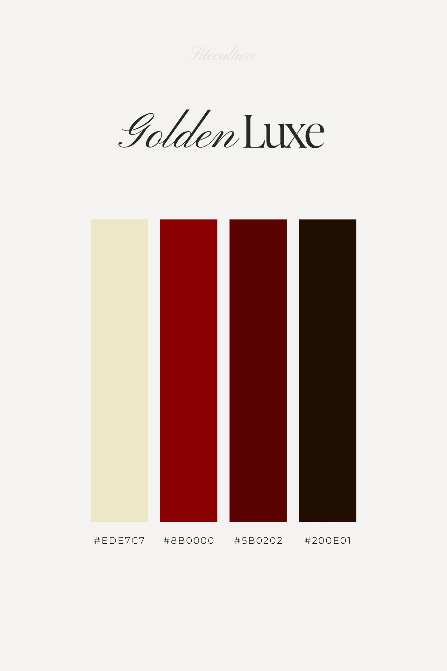
3. Golden Luxe
If you’re looking to make a statement, here’s your microphone. The Golden Luxe palette is bold, it’s brash, it’s the life of the party. It’s all about that rich red and deep brown contrasted with a vibrant gold. It doesn’t just say luxury; it shouts it from the rooftops.
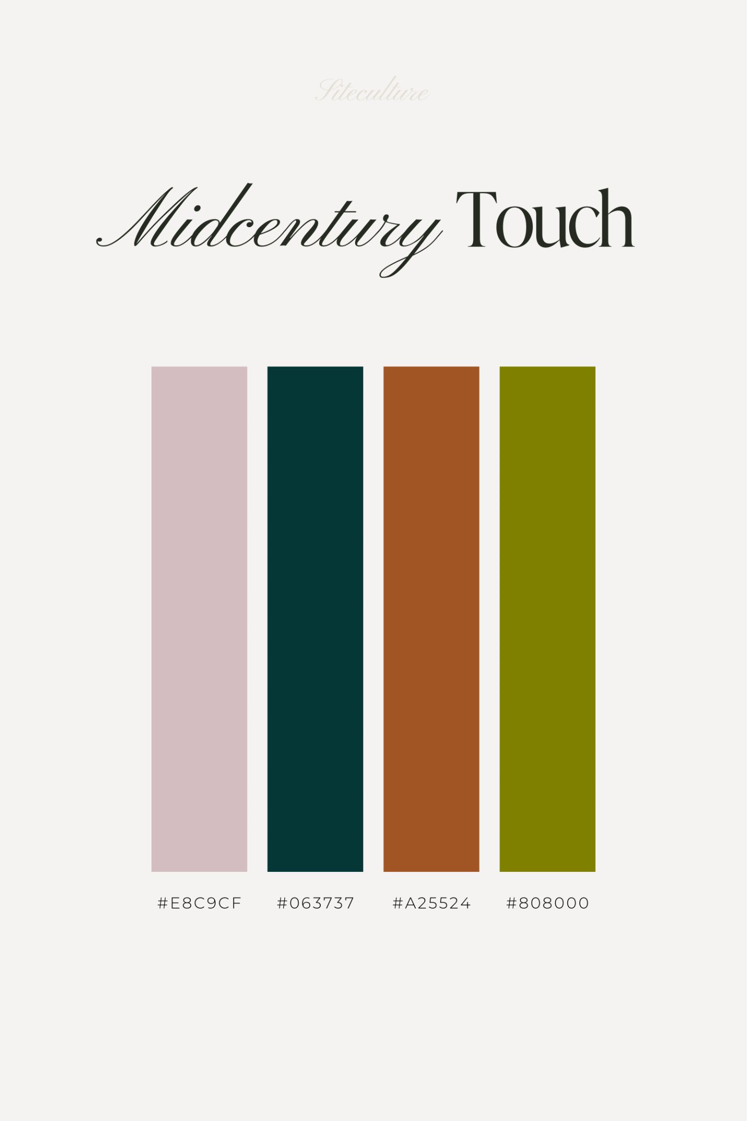
4. Midcentury Touch
A little retro, a lot relevant. Midcentury Touch takes the best of the past—think Mad Men cool—and updates it for today’s scene. Pink, teal, umber, olive; these are colors that say you respect the classics but aren’t stuck in them.
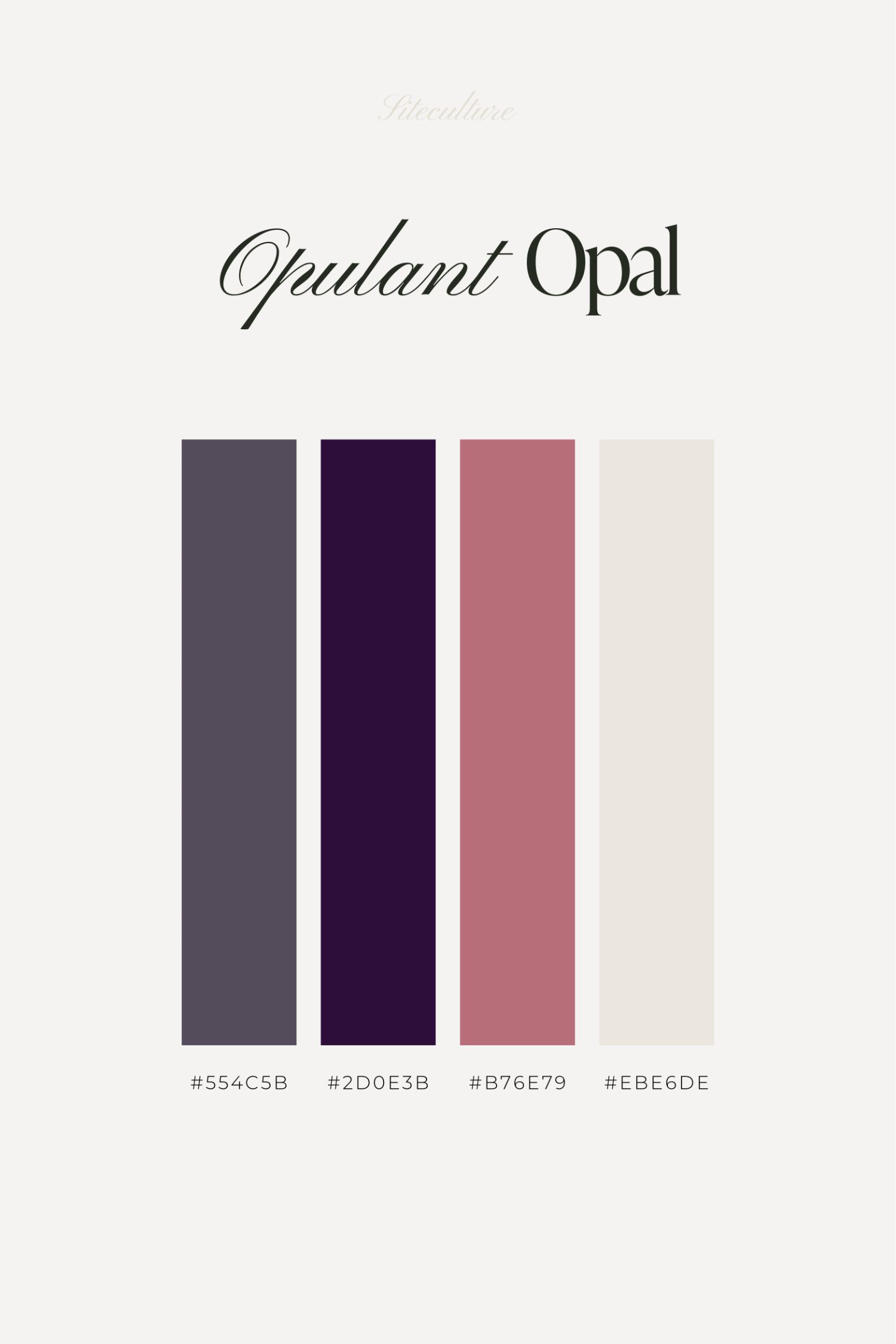
5. Opulent Opal
Here’s to the dreamers. Opulent Opal is for brands that want to whisper their worth rather than shout. With sophisticated blues, purples, and pinks, this palette is like your secret garden—exclusive, enchanting, and a little mysterious.
Choosing your brand’s colors is like picking the right words to tell your story. It’s about matching shades to your brand’s voice. Remember, the right color palette does more than look good—it feels right to your customers. It’s the visual handshake that says, “We understand you, we’ve got what you need, and we’re here to stay.”
Takeaways of a Luxury Brand Color Palette
The color palette is a fundamental component of your brand identity and choosing the right colors is a pivotal decision. In the luxury market, your colors reflect the essence of your brand’s quality and exclusivity. Remember, the goal is not just to choose beautiful colors but to select a palette that will resonate with your audience, enhance brand recognition, and support the overall positioning of your brand as a leader in the luxury market.
At Siteculture, we understand the unique challenges and aspirations of small business owners seeking to carve out a niche in the luxury segment. Crafting a color palette is just the beginning. Let us guide you through each step of building a brand that not only stands out but also stands the test of time, ensuring your venture grows into a lasting legacy.